Elements

Application #

Add as many backgrounds as you like, divided into light and dark variants. This makes it easier for you to perfectly match text and box colors to the respective background. In the following 6 steps, we will show you how to manage your backgrounds and add new ones.

Find element overview #

To customize the elements, click on the last item „Elements“.

1
Elements
Select „Elements“ to see all customizable elements.
Elements Overview #

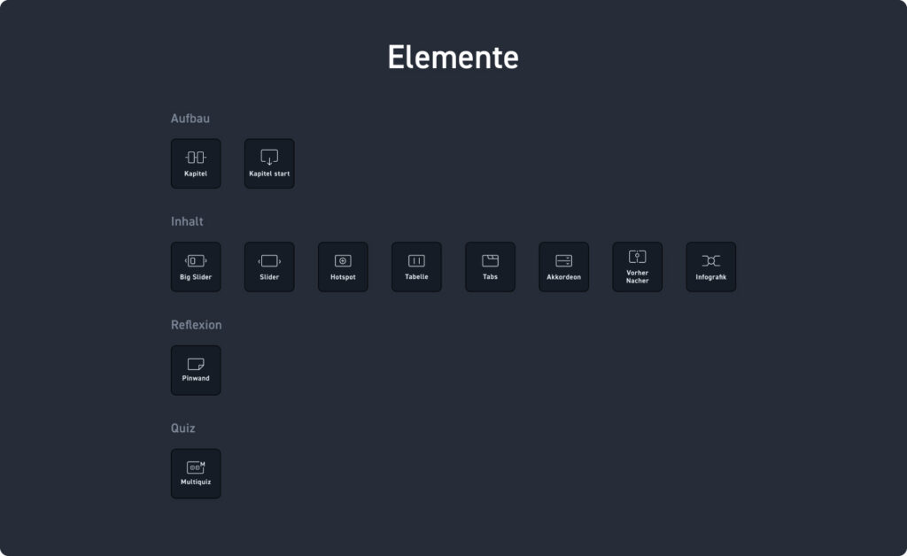
In the elements overview, just like in the editor, you will find the overview with all customizable elements, which are 12 in total. We show you here which ones they are and what adjustments can be made. As before, swap out the background colors to see how the elements look on your backgrounds.

Structural elements #

Chapter  #

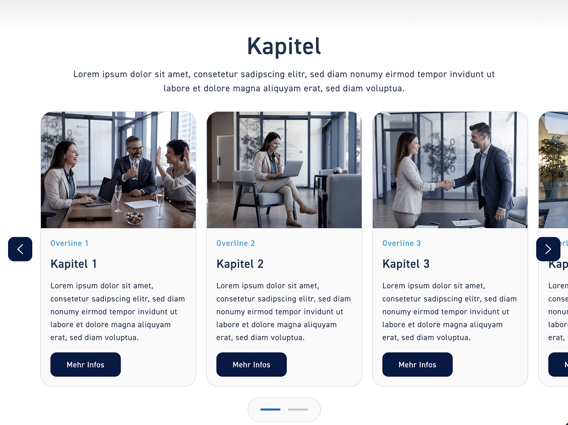
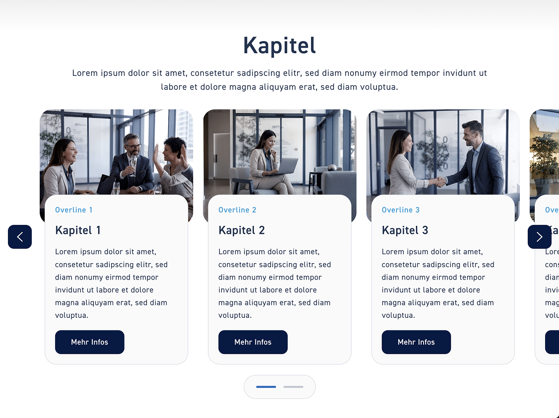
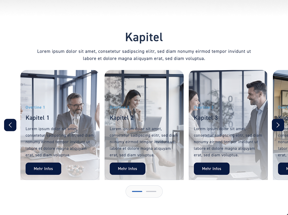
Click on „Chapters“ to customize the style of the chapter overview. You have three styles to choose from. Select one and then click the „Save“ button.

Kapitel Übersicht

Classic style #

If you select „Classic“, we will keep all previous settings and only change the design of the elements.

Float style #

In the float style, the box floats centered below the image.

Glass Style #

With the glass style, there is no box. Instead, the contents are distributed across the image. 

Chapter Start #

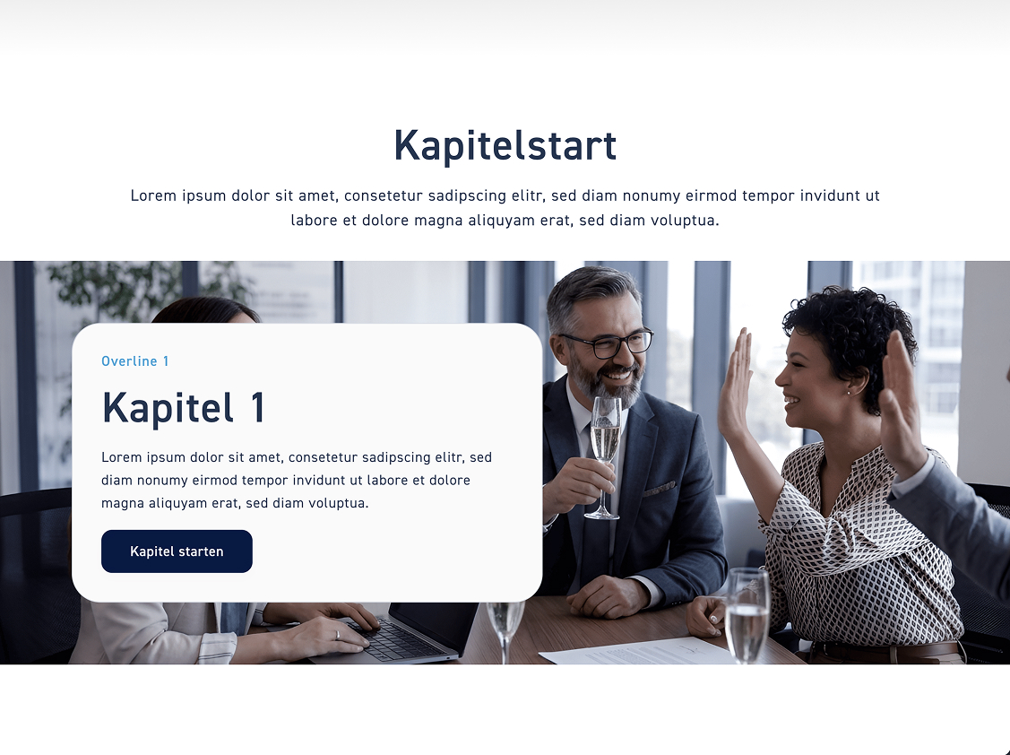
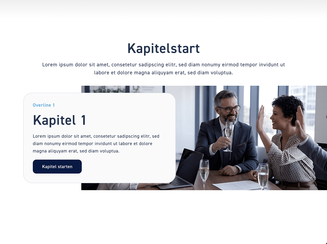
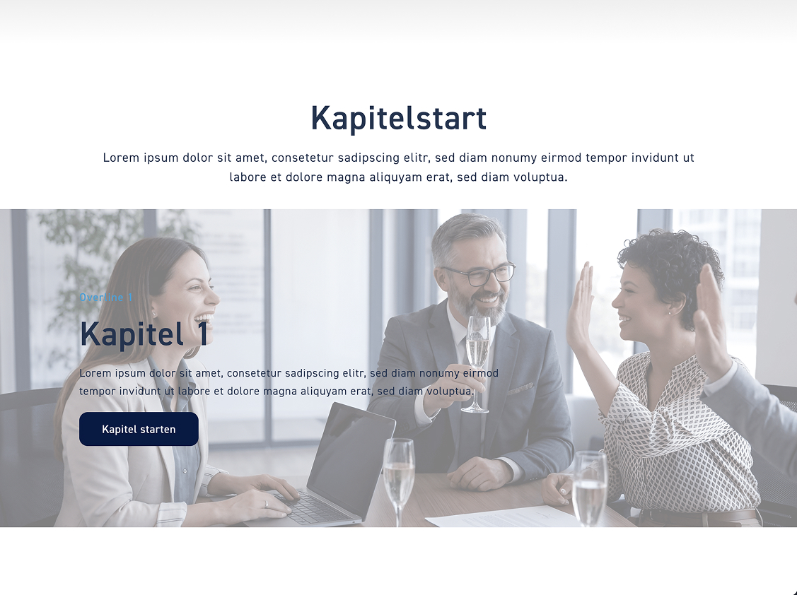
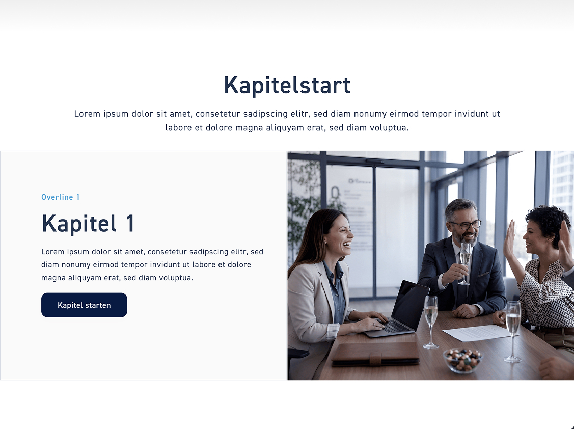
Click on „Chapter Start“ to customize the style of the chapter start. Four different styles are available to you. Select a style and then click the „Save“ button.

Kapitel start

Classic style #

The Classic style has the box in the picture. If you choose the Classic style, you can additionally adjust the alignment, meaning whether the box is on the left or the right.

Float style #

With the float style, the box floats over the image. If you choose the float style, you can also set the alignment, whether the box is on the left or the right.

Glass Style #

In the glass style, there is no box. Instead, the contents are distributed across the image. If you choose the glass style, you can also adjust the alignment—meaning whether the contents are positioned on the left, in the center, or on the right.

Tile style #

The tiles style divides the element separately into image and content. You can decide whether the content box is on the left or the right.

Content elements #

Big Slider #

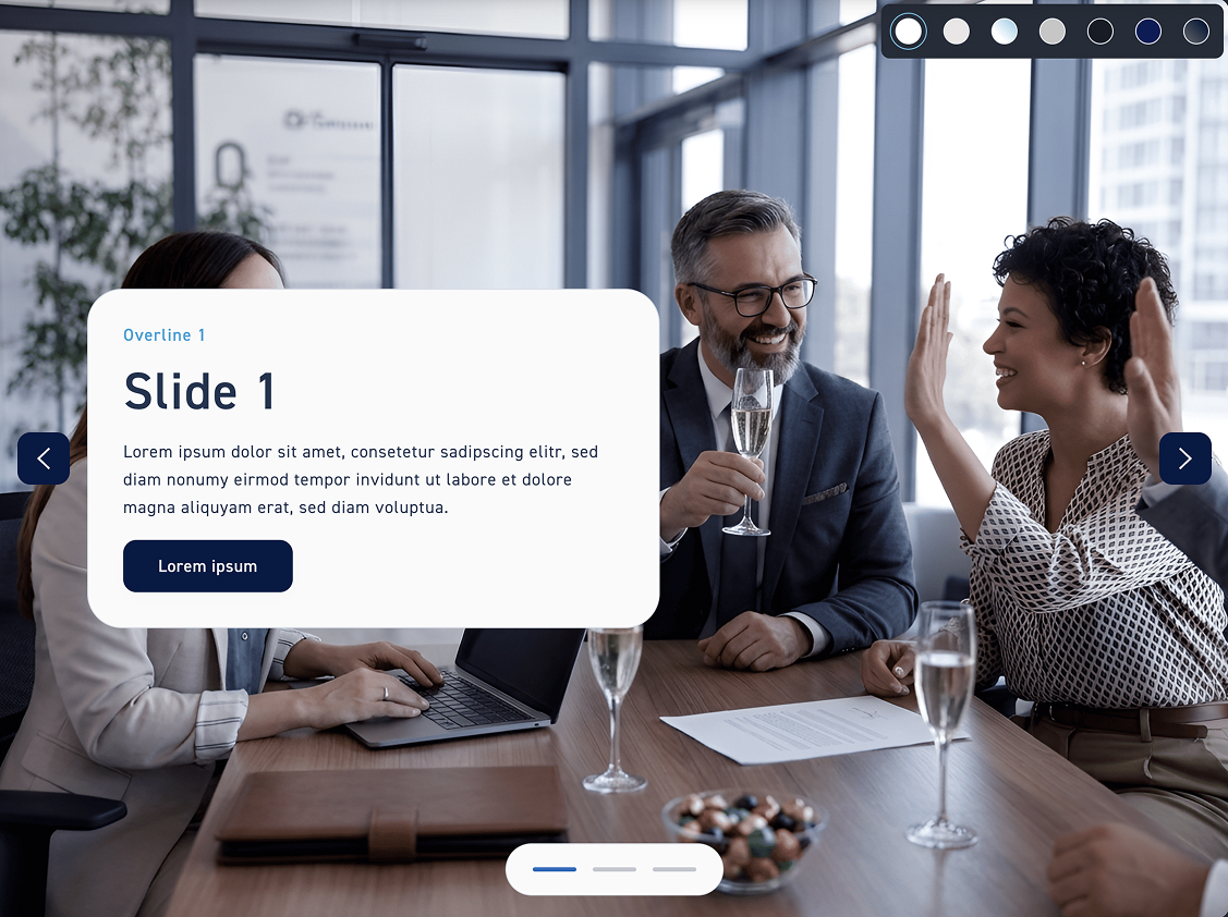
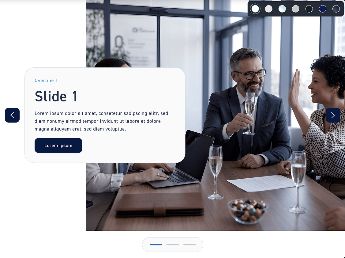
Click on „Big Slider“ to customize the style of the big slider. You have four styles available. Choose one and then click the „Save“ button.

Big Slider

Classic style #

The Classic style has the box in the picture. If you choose the Classic style, you can additionally adjust the alignment, meaning whether the box is on the left or the right.

Float style #

With the float style, the box floats over the image. If you choose the float style, you can also set the alignment, whether the box is on the left or the right.

Glass Style #

With the glass style, there is no box. Instead, the contents are distributed across the image. If you choose the glass style, you can additionally adjust the alignment – meaning whether the contents are positioned on the left, in the center, or on the right.

Tile style #

The tiles style divides the element separately into image and content. You can decide whether the content box is on the left or the right.

Slider #

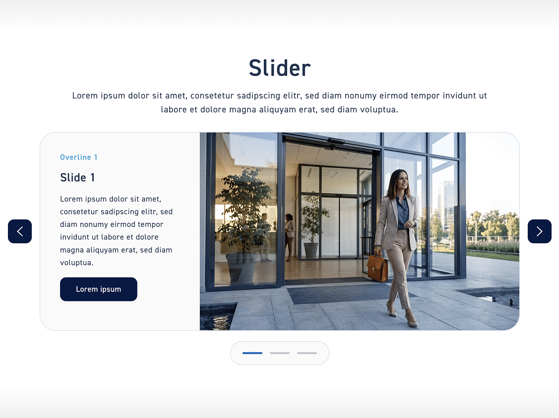
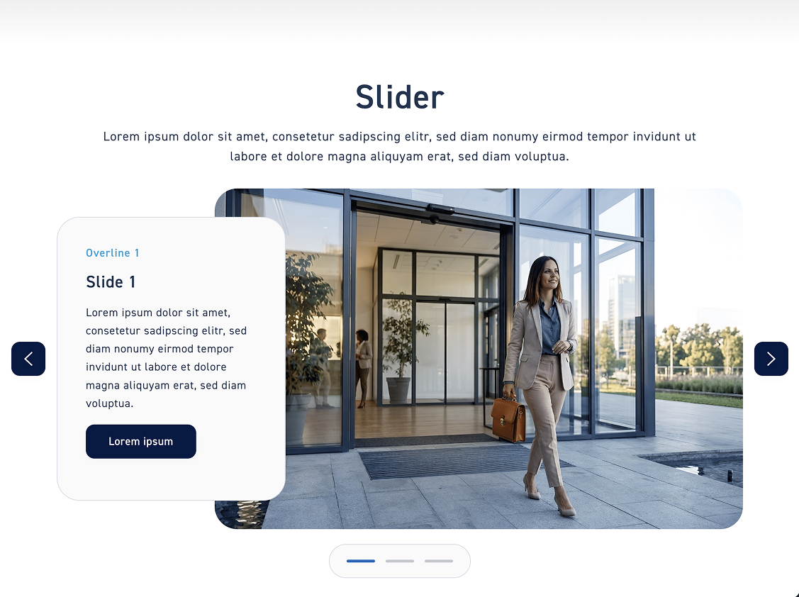
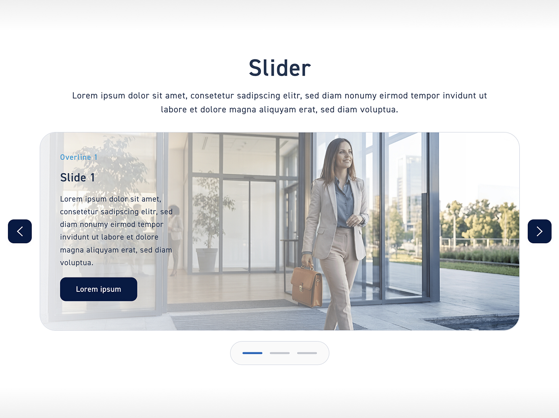
Click on „Slider“ to customize the style of the slider. You have three styles available. Choose one and then click the „Save“ button.

Slider

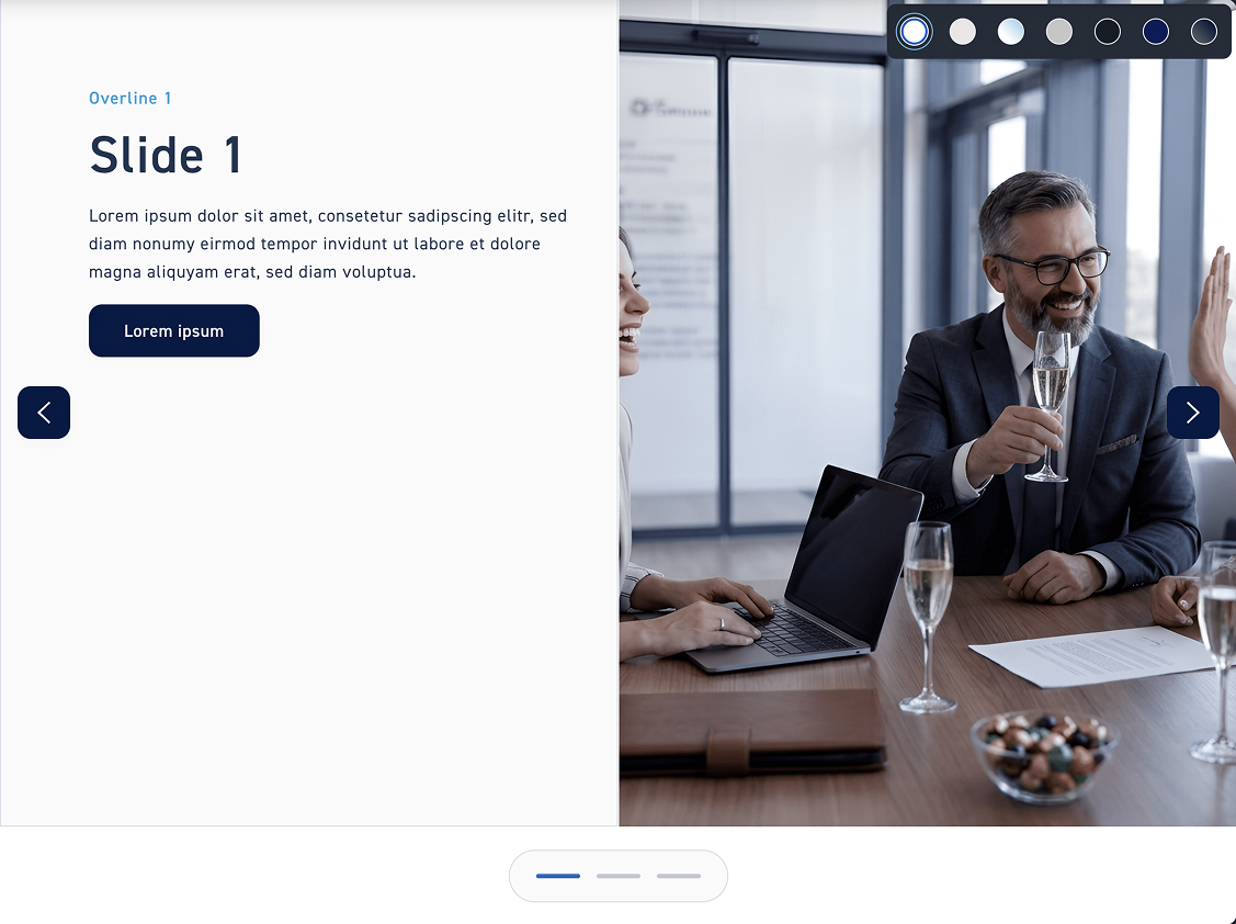
Classic style #

In the classic style, there is a clear division between the content box and the image. If you choose the classic style, you can also adjust the alignment – meaning whether the box is positioned on the left, in the center, or on the right.

Float style #

With the float style, the content box floats over the image. If you choose the float style, you can also adjust the alignment to determine whether the box is positioned on the left, in the center, or on the right.

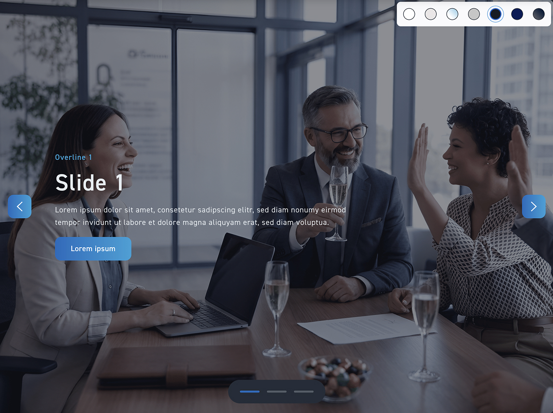
Glass Style #

In the glass style, there is no box. Instead, the contents are distributed across the image. If you choose the glass style, you can additionally set whether the box is positioned on the left, in the center, or on the right.

Hotspots #

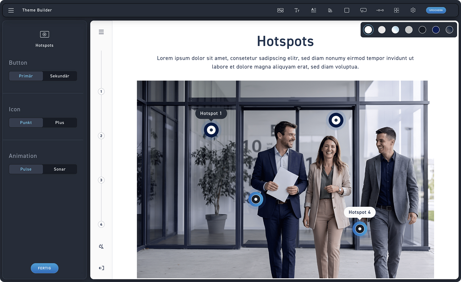
Click on „Hotspots“ to customize the style of the hotspots. You have three styles available. Choose one and then click the „Save“ button.

Hotspots
1
Button
Choose between a primary and a secondary hotspot.
2
Icon selection
Decide whether your hotspots should have a dot or an interactive plus in the center.
3
Animation
Choose how your hotspots are animated. The available options are „Pulse“ and „Sonar“.“
Primary-Point-Pulses #

Look at how the settings affect the hotspots

Float style #

With the float style, the content box floats over the image. If you choose the float style, you can also adjust the alignment to determine whether the box is positioned on the left, in the center, or on the right.

Glass Style #

In the glass style, there is no box. Instead, the contents are distributed across the image. If you choose the glass style, you can additionally set whether the box is positioned on the left, in the center, or on the right.

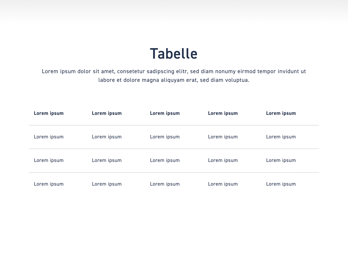
Table #

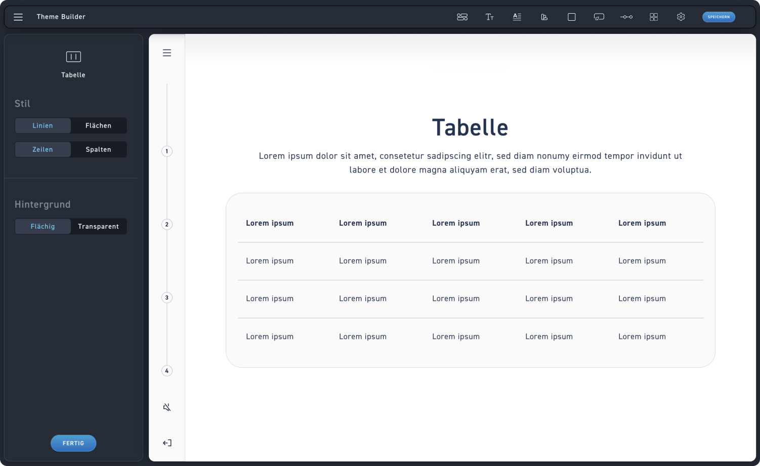
Click on „Table“ to adjust the table style. Take a look at the options.

Tabelle
1
Style
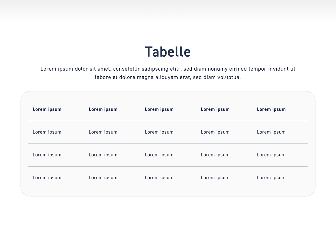
Choose whether your table has lines or areas. In addition, you can choose between rows and columns and configure exactly the combinations that work best for you.
2
Background
Set whether the table should be solid or transparent.
Select style #

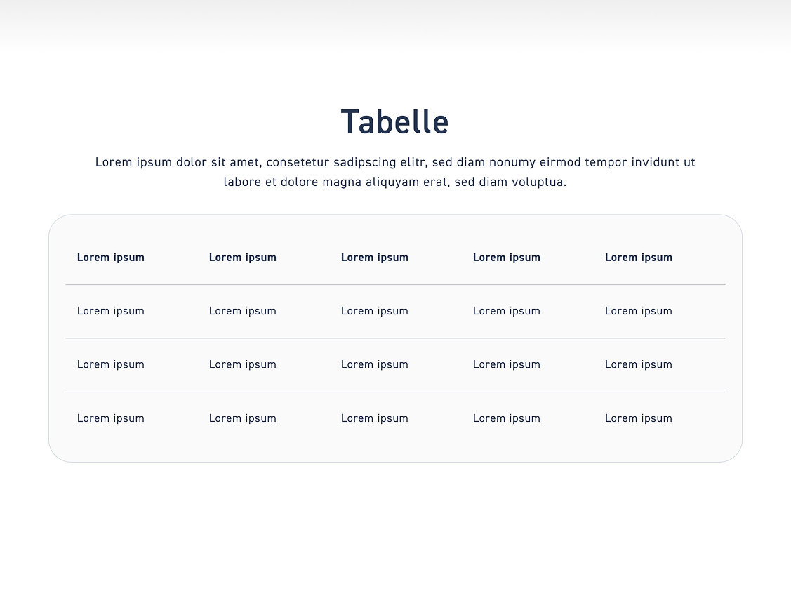
Lines #

See how the settings affect the design of the table.

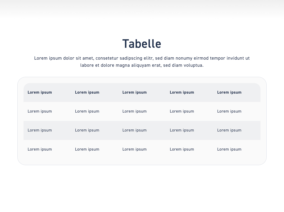
Areas #

If you choose backgrounds, every second row will get a background area.

Step 2 – Select style #

Click on „Table“ to adjust the table style. Take a look at the options.  

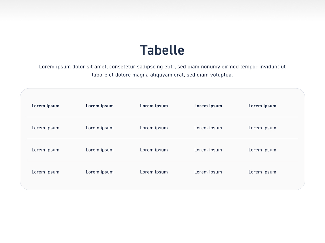
Lines #

See how the settings affect the design of the table.

Columns #

If you choose backgrounds, every second row will get a background area.

Step 3 – Background #

Areal #

See how the settings affect the design of the table.

Transparent #

If you choose backgrounds, every second row will get a background area.

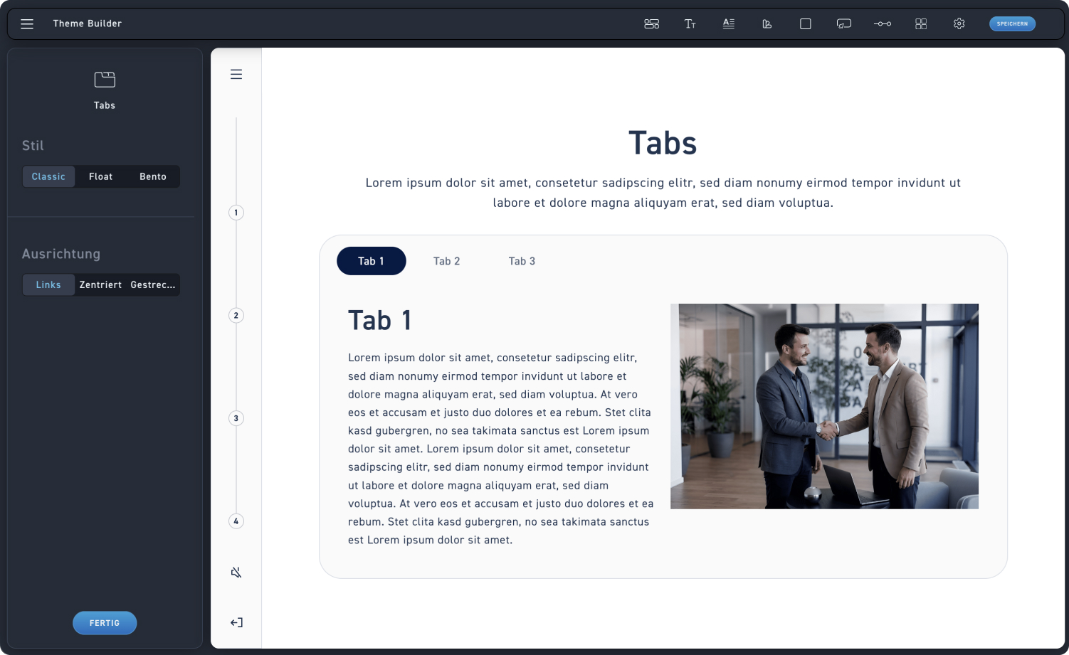
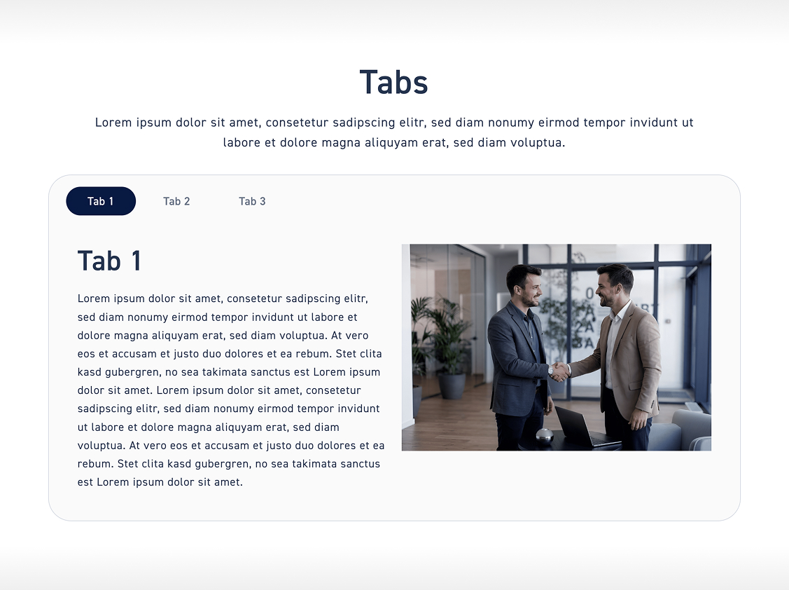
Tabs #

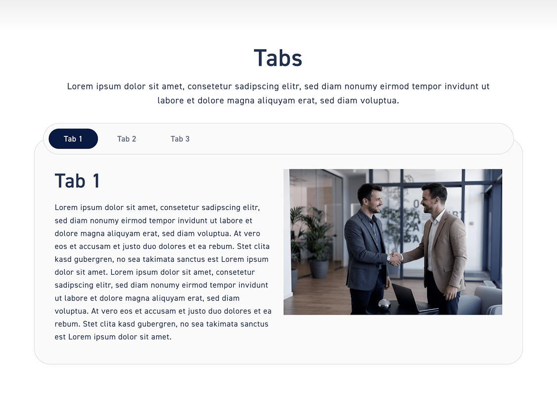
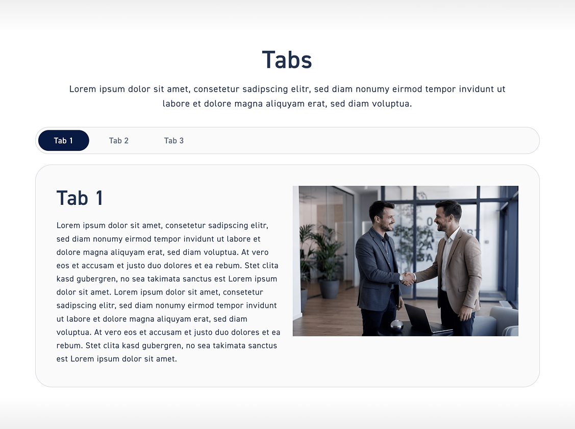
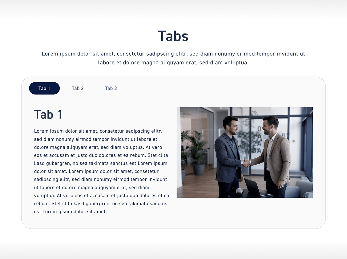
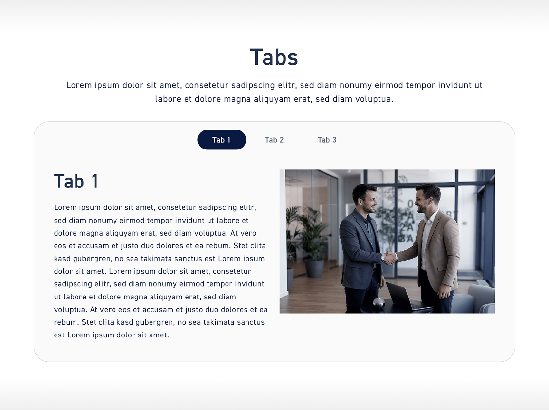
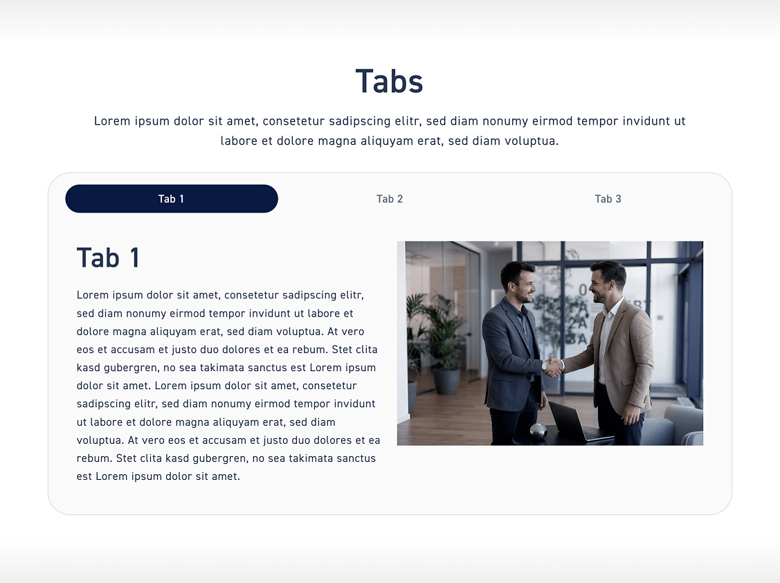
Click on „Tabs“ to customize the style of the tabs. We will go through all the available options step by step.

Tabs

Style #

Click through the three different styles and save one of them for your theme.

Classic style #

Click „Classic" to apply the Classic style.

Float #

Click „Float" to apply the float style. 

Bento #

Click „Bento" to apply the Bento style.

Alignment #

Click through the three different tab alignments and save one of them for your theme.

Links #

Click on „Left“ to align the tabs to the left.

Centered #

Click „Centered“ to align the tabs in the middle of the box.

Plugged #

Click „Stretched“ to align the tabs across the entire width of the box.

Accordion #

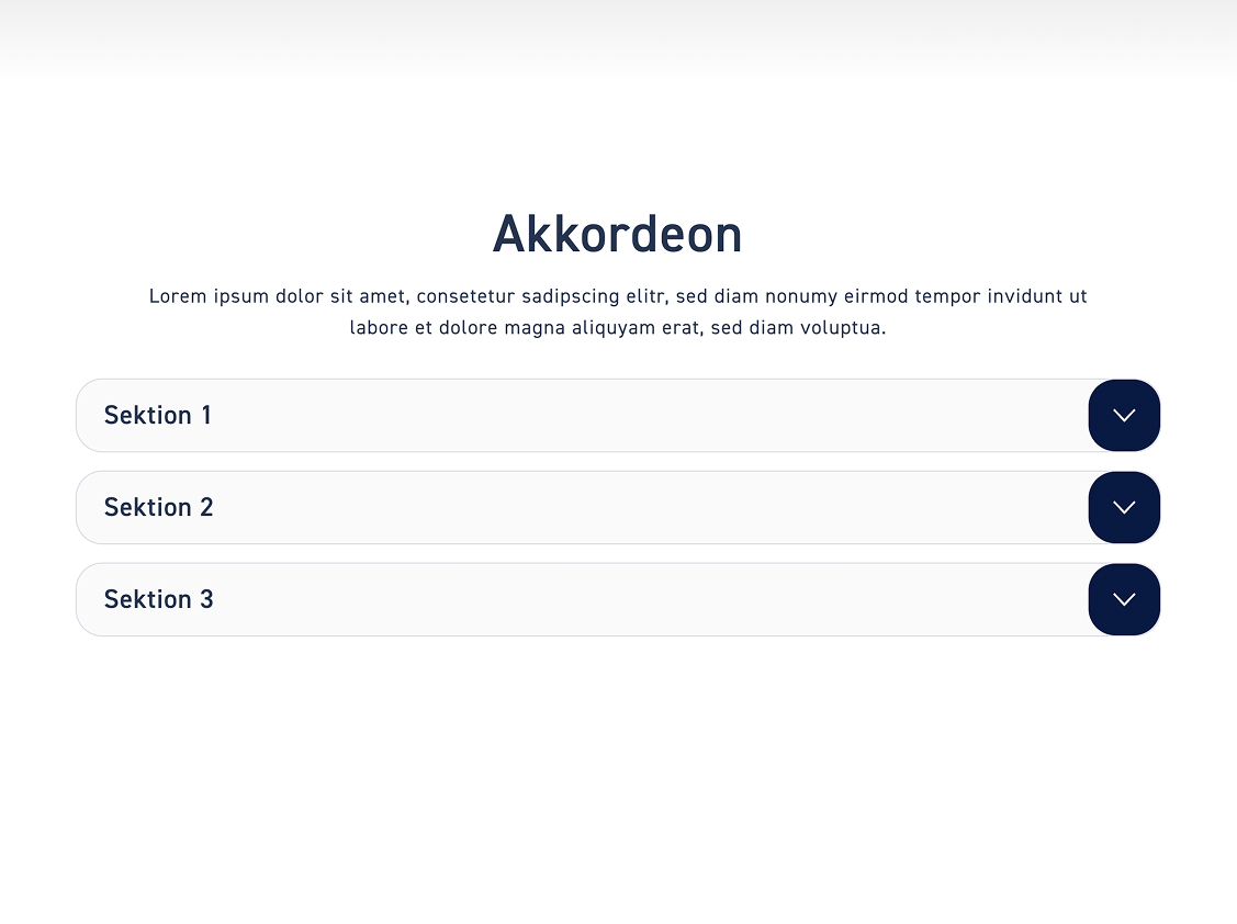
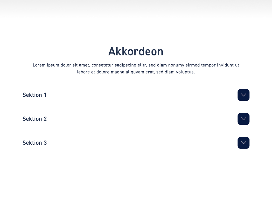
Click „Accordion“ to customize the tab style. We will go through all the options step by step here.

Akkordion

Transparency #

Decide whether your accordions are transparent or not.

Areal #

Leave the toggle off if the accordions should be full-width.

Transparent #

Turn on the toggle if the accordions should be transparent.
Arrows or plus #

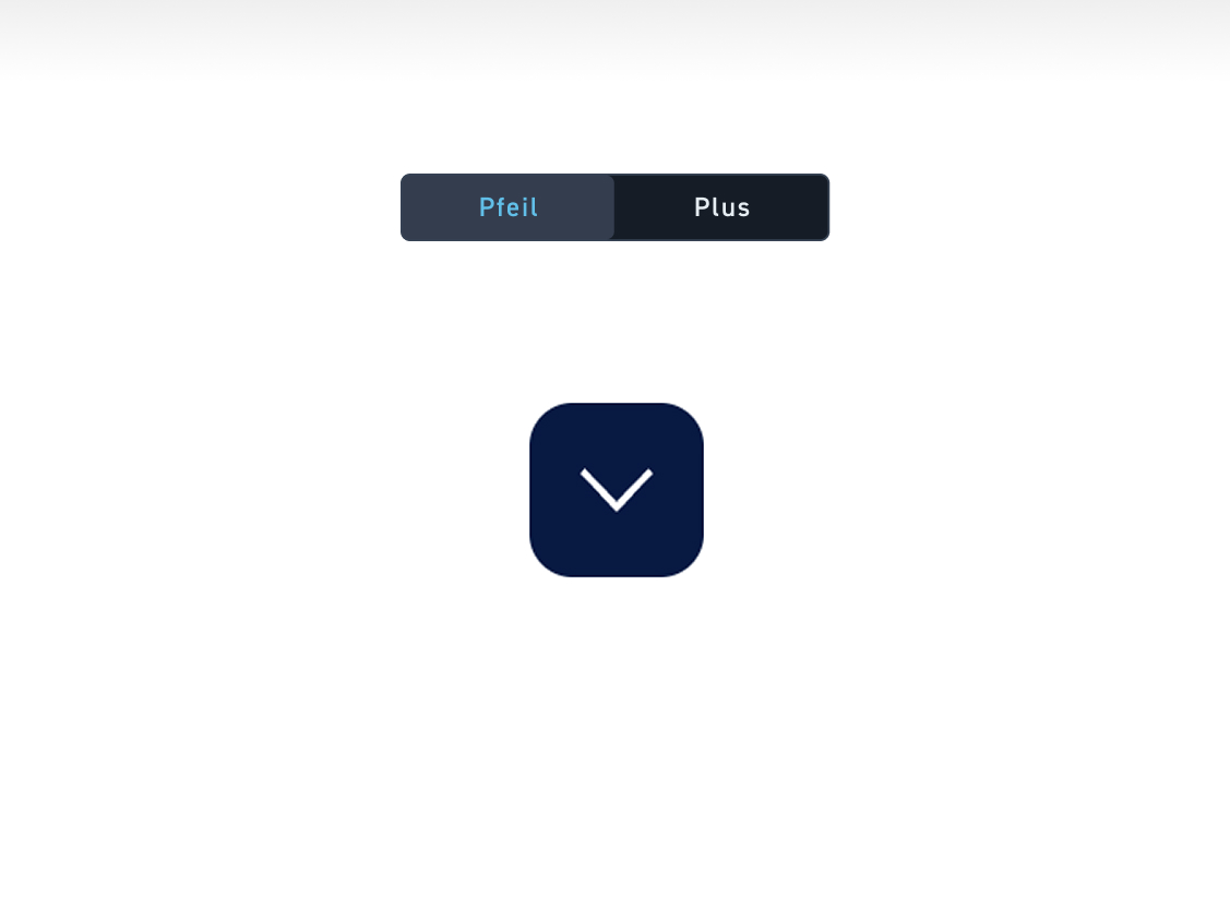
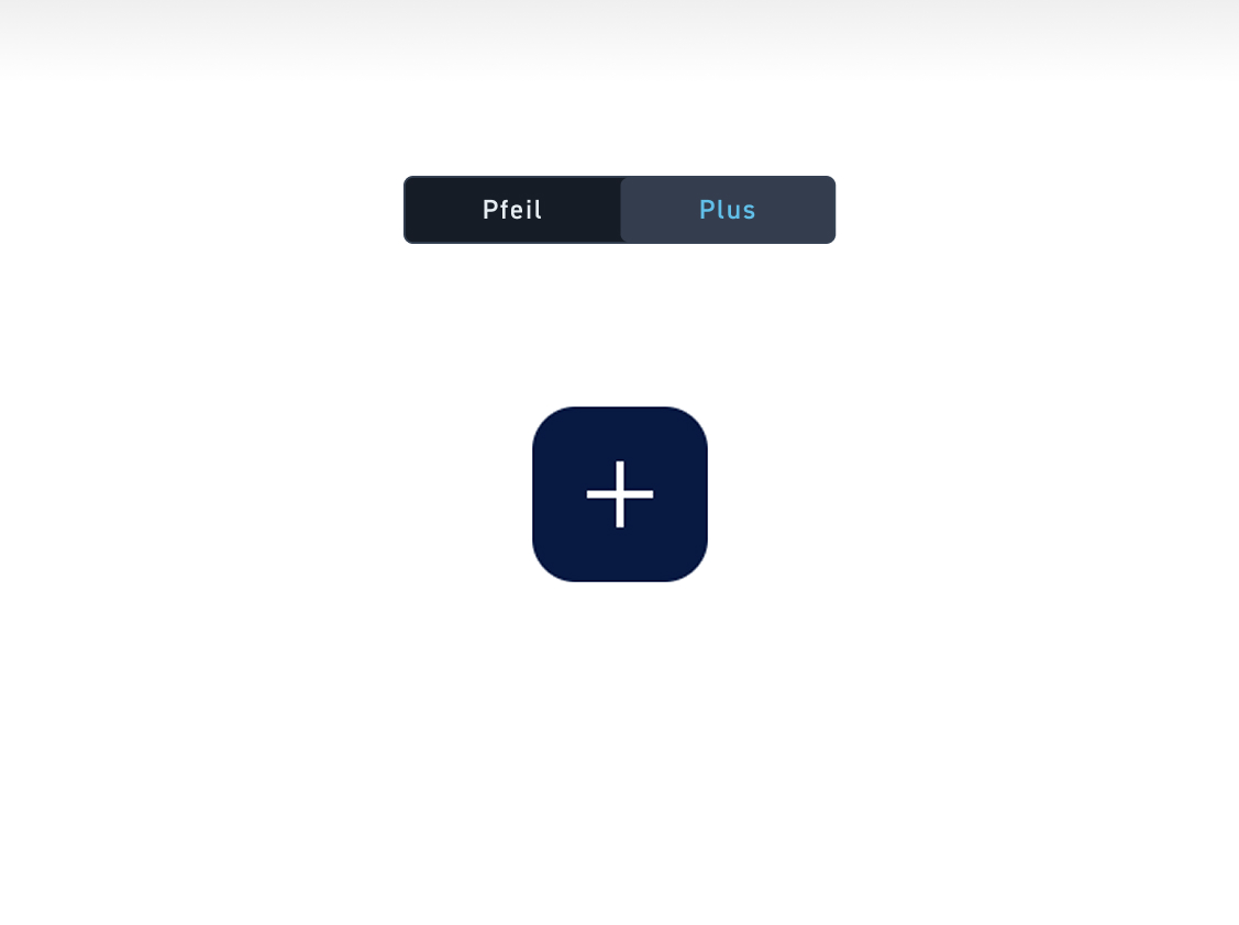
Decide whether your accordions should have arrows or a plus / minus icon.

Arrow #

Click „Arrow“ if you want your accordions to open by clicking on the arrows.

Plus #

Click „Plus“ if your accordions should open by clicking the plus.

Alignment #

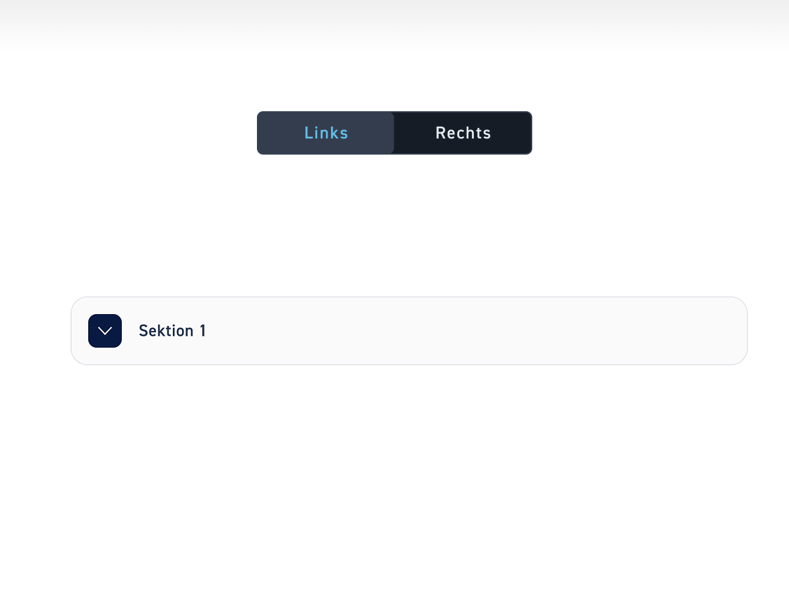
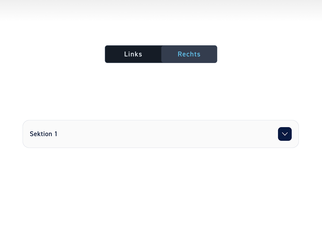
Decide whether your accordion arrows/pluses are on the left or right.

Links #

Click on „Links“ if the arrows/pluses of your accordions should be on the left.

Right #

Click „Right“ if you want the arrows/pluses of your accordions to be on the right.

Button art #

Finally, decide what type your buttons should be

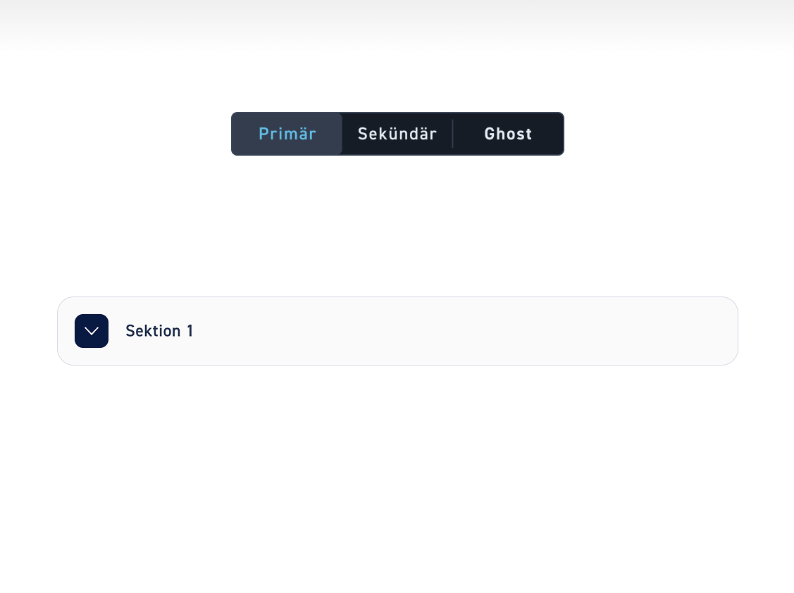
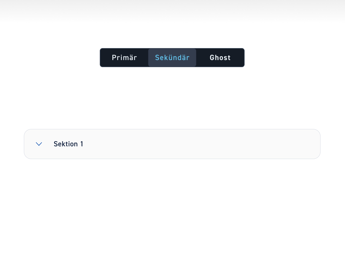
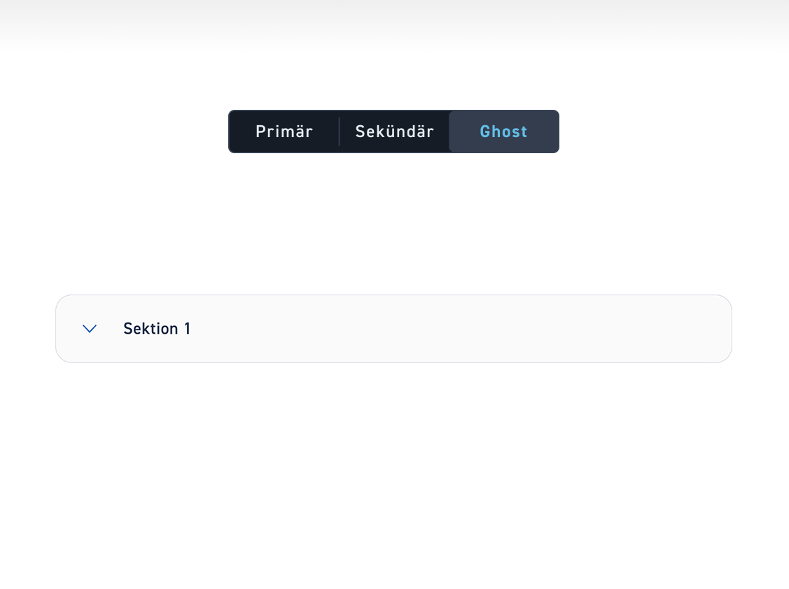
Primary #

Click on „Primary“ if the arrows/pluses should be displayed in a primary button style.

Right #

Click „Secondary“ if the arrows/pluses should be displayed in a secondary button style.

Ghost #

Click on „Ghost“ if the arrows/pluses should be displayed in a ghost button style.

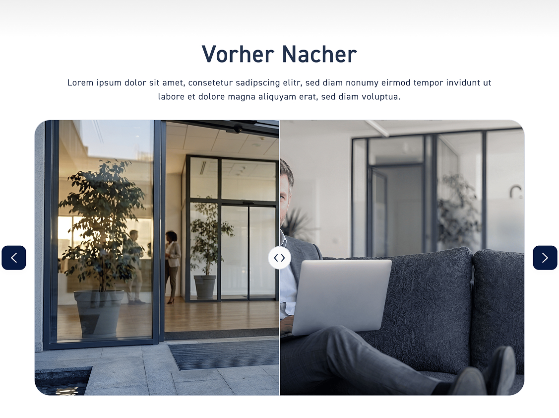
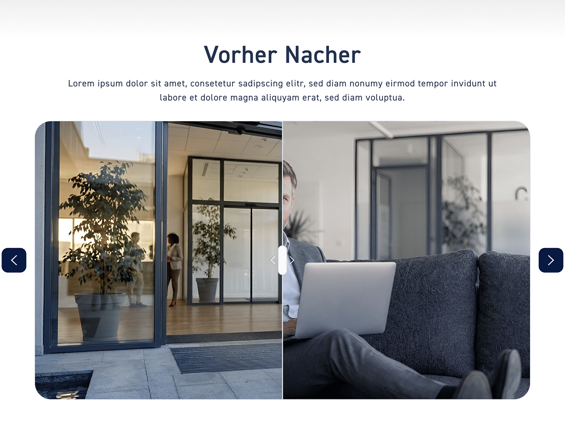
Before After #

Click on „Before/After“ to adjust the handle design of the Before/After element. We will go through both options step by step here.

Vorher Nacher

Round #

If the slider is to be round, click „Round“.

Pill #

If the slider to drag should be a pill with arrows, click „Pill“.

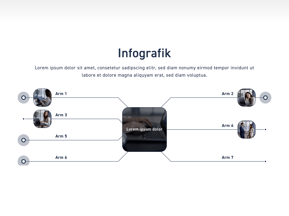
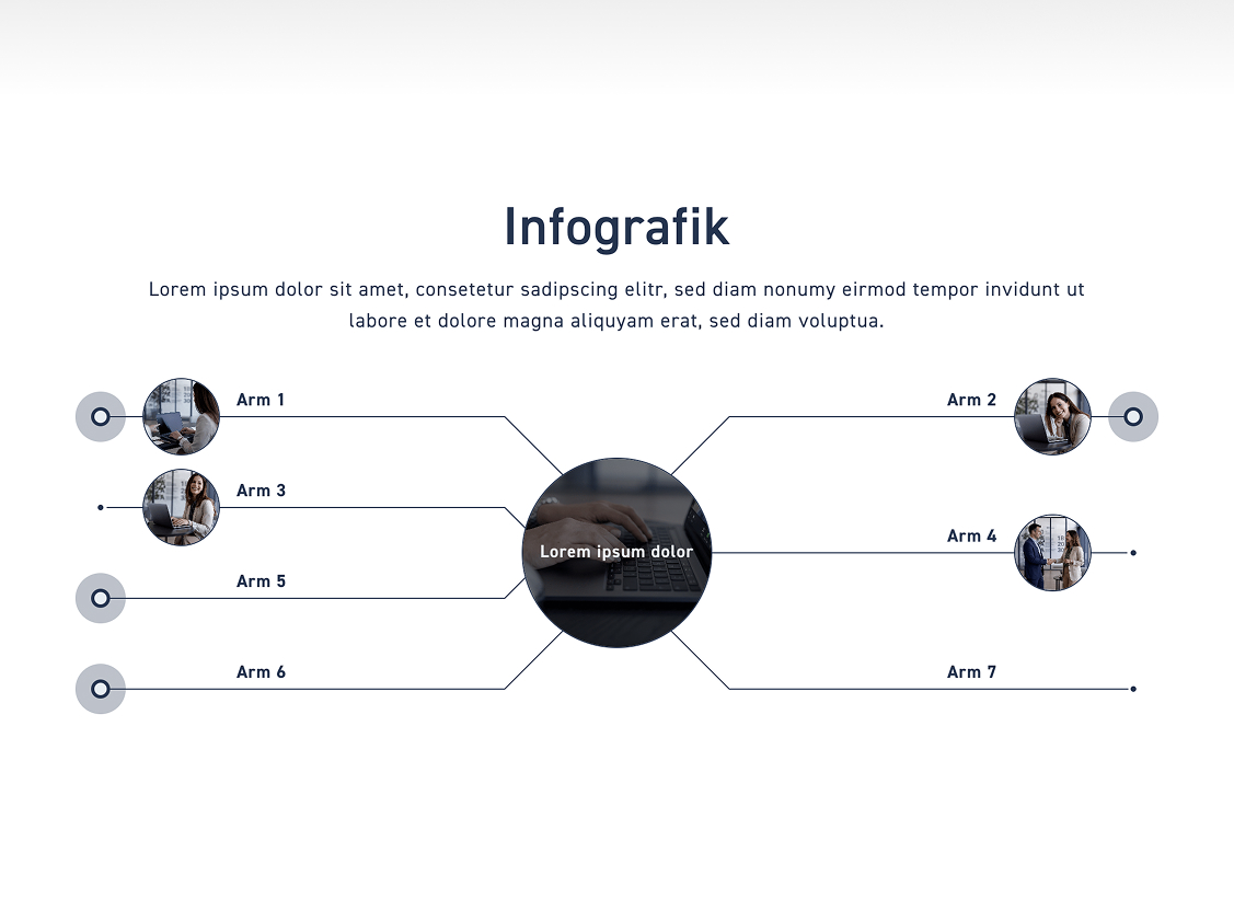
Infographic #

Click on „Infographic“ to customize the style of the infographic element. We will go through all the setting options step by step here.

Frame 4411

Adjust infographic style #

Angular #

Leave the toggle off if the images/icons should adapt to the corner radius you set in the style.

Round #

Turn on the toggle if the images/icons should be completely round.

Layout of the infographic labels #

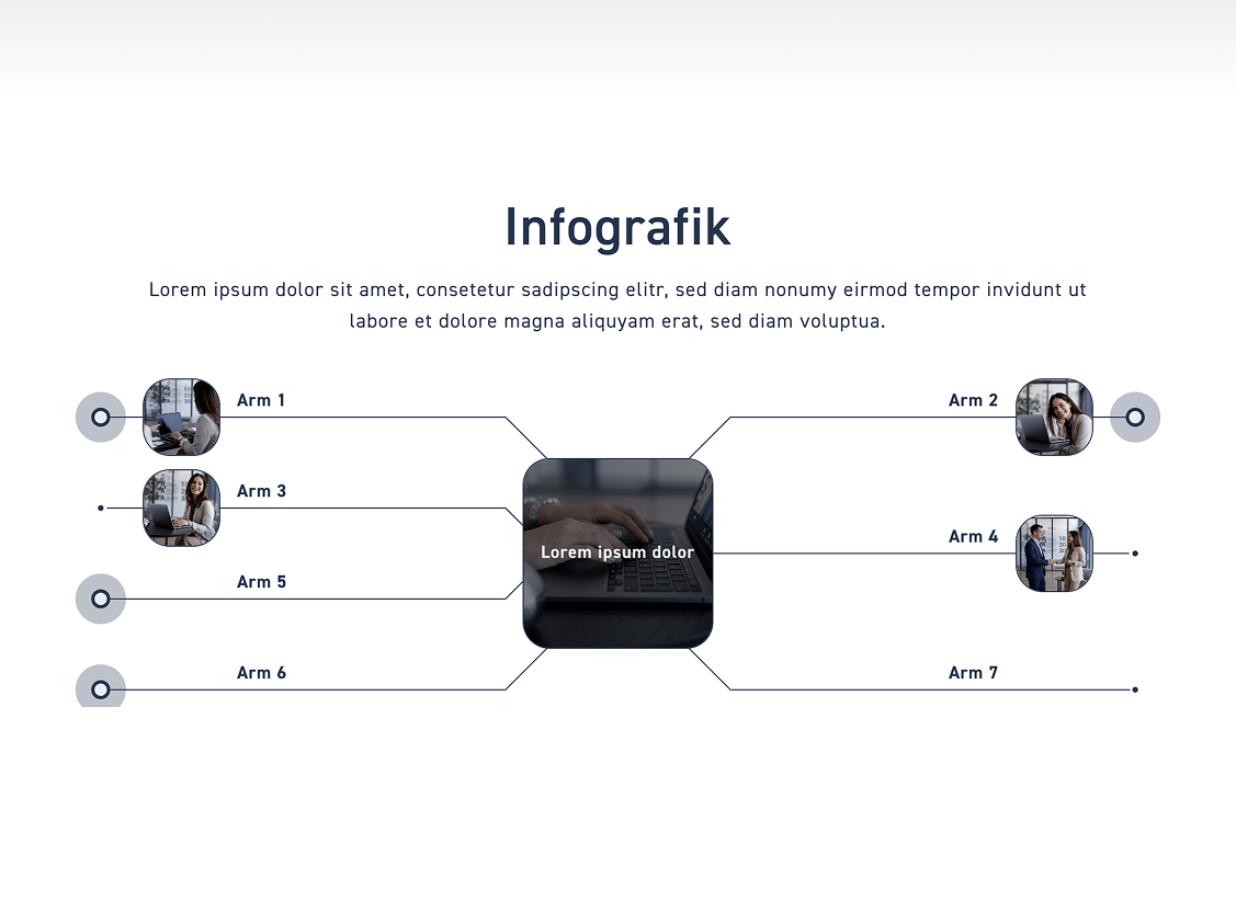
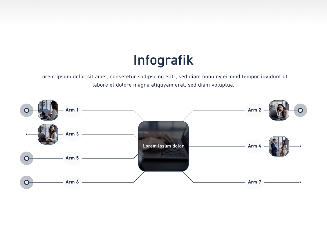
Determine whether the labels lie as an area on the lines or are placed directly on them.

Up #

If you click on „Top“, the labels are on top of the arms.

Mitte #

If you click on „Center“, the labels lie directly on the arms.

Bulletin board #

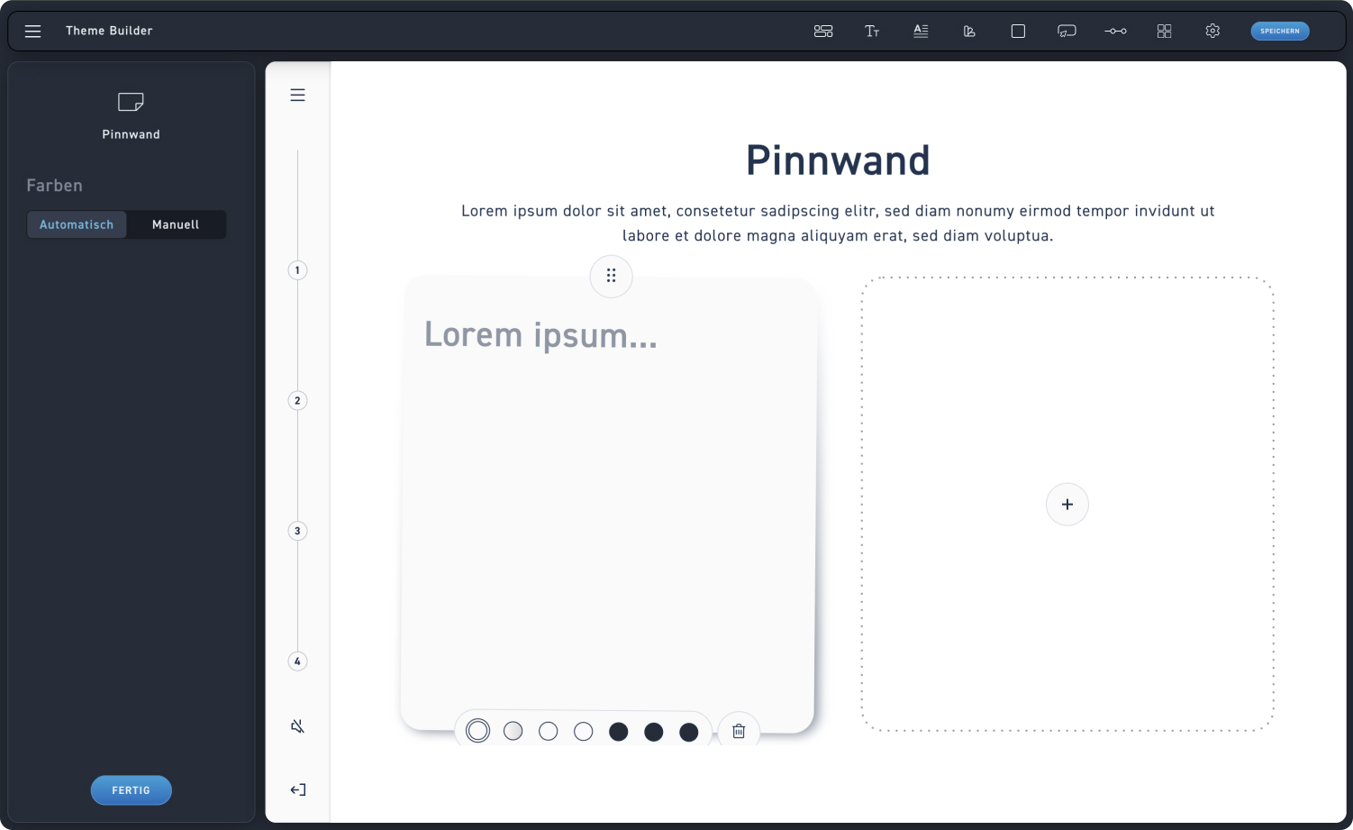
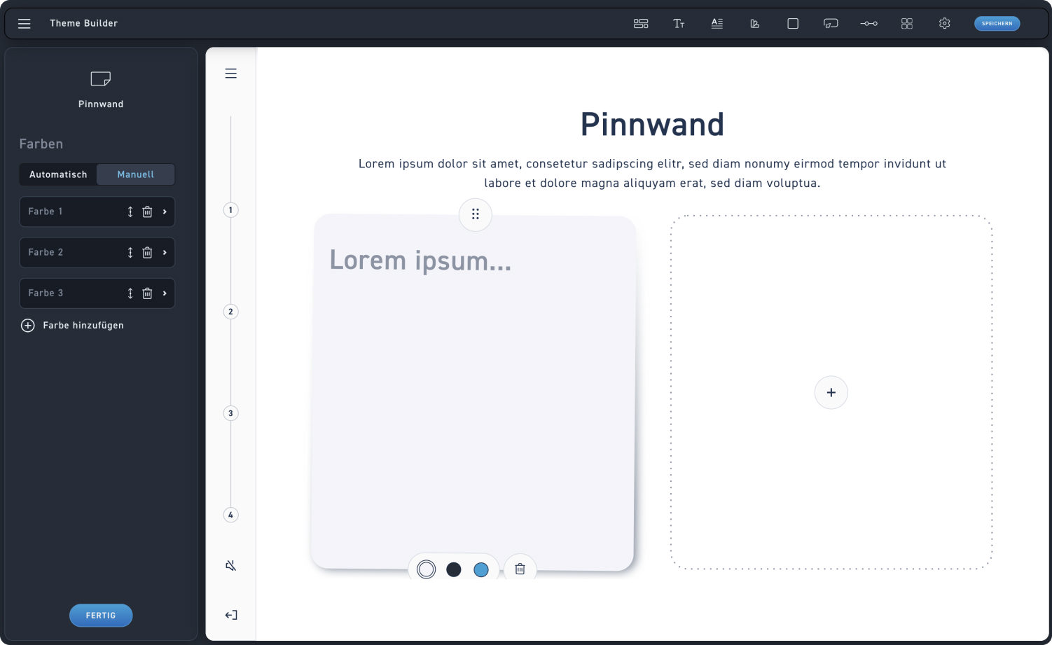
Click on „Pinboard“ to customize the element's colors. We will go through all the settings step by step here.

Pinboard
1
Automatic color selection
Click „Automatic“ if excelerate should automatically apply all available colors for the pinboard element.
2
Color selection
Look at all the colors the system has adjusted for you.
1
Manual color adjustment
Click „Manual“ if you want to set the colors for your learners yourself.
1
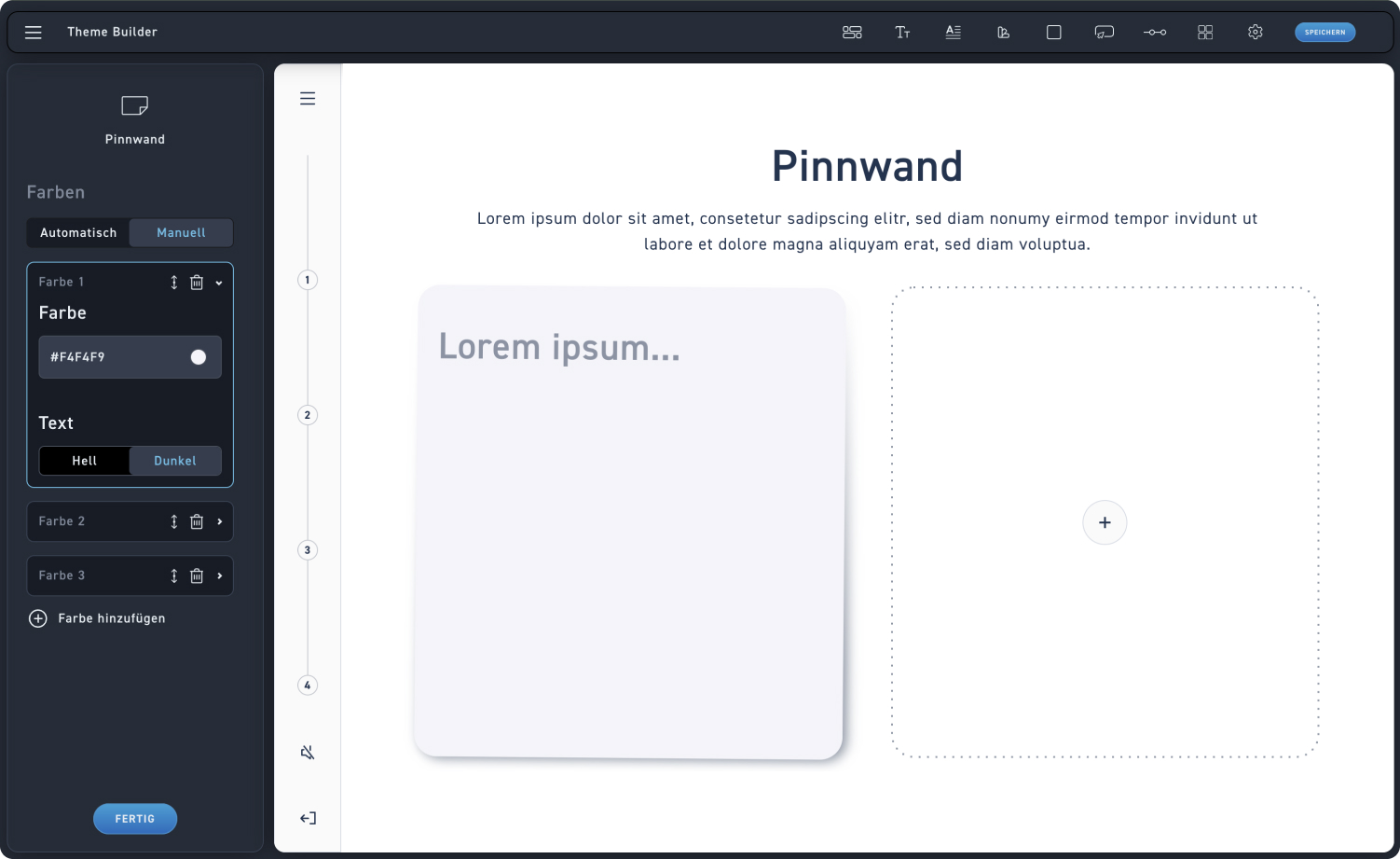
General operation
Open a color by clicking on the color swatch. You can increase the number of colors by adding a new color, or minimize them by deleting a color using the trash can icon. Additionally, you can change the order in which the colors appear for the learners.
2
Adjust color
Adjust the desired color using the color picker.
3
Text
Set whether the text on the chosen color should be light or dark.