Buttons

Writings
Select buttons to see more settings.
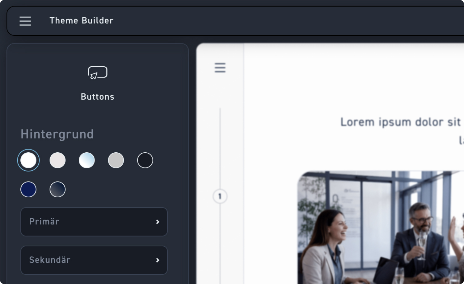
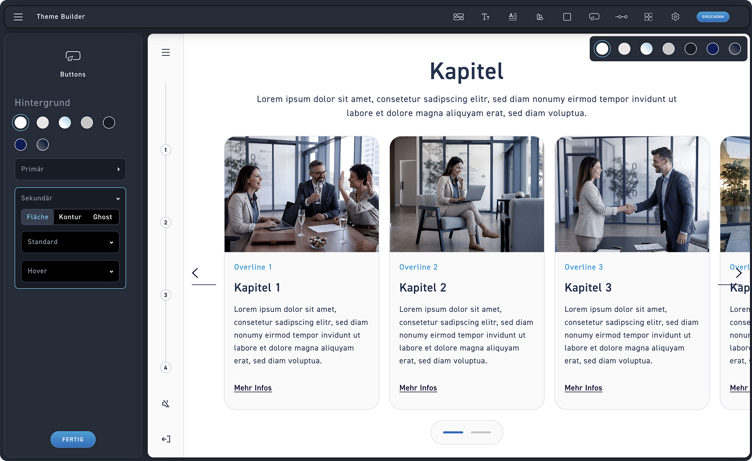
Background selection
Click on one of your existing backgrounds to match the primary and secondary buttons to that background.
Button Settings
The button overview consists of primary and secondary buttons. We will take a look at the customization options behind them in the next step.
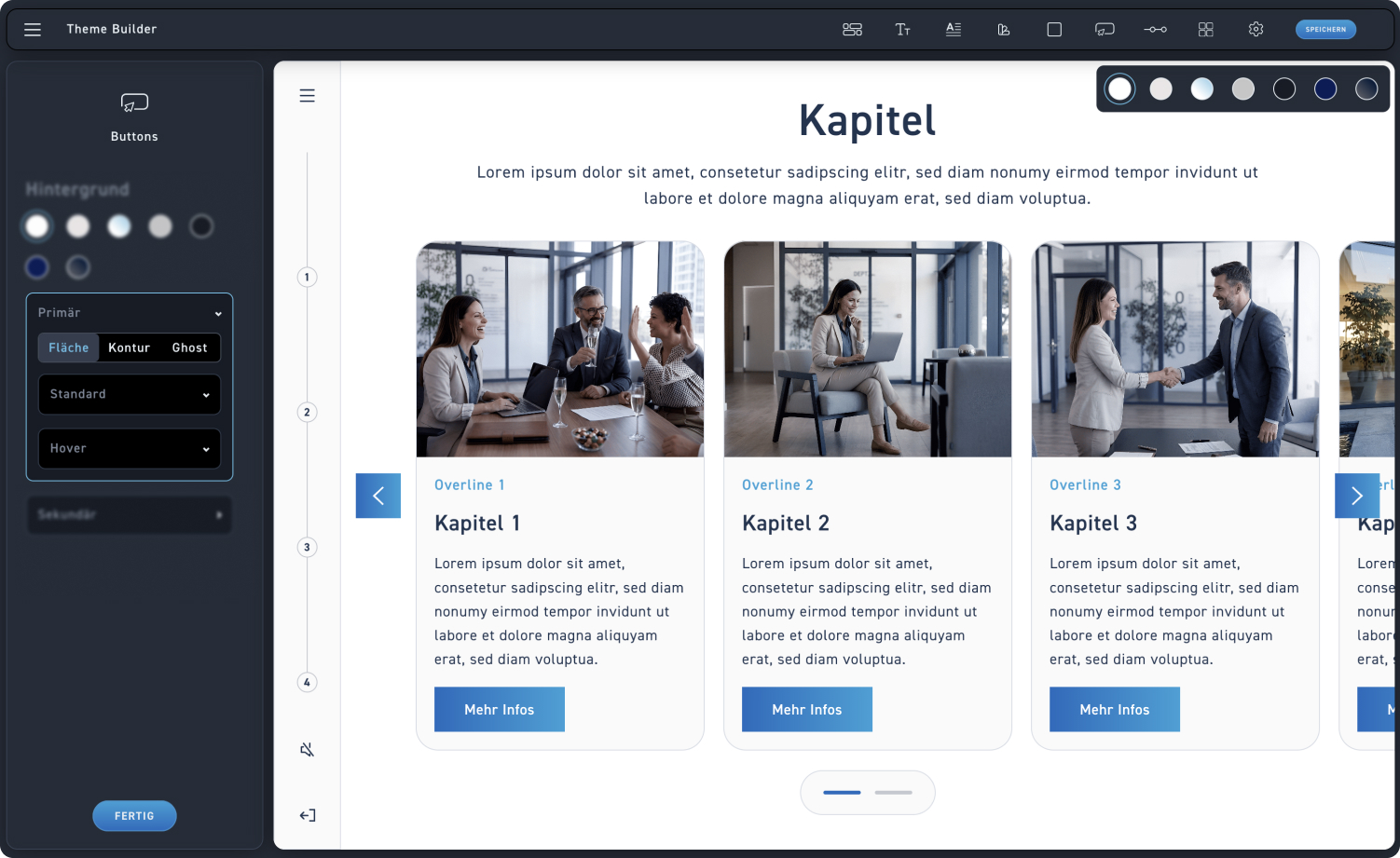
Button type
You have three options to find the perfect button type. You can choose between a filled button, outline, or ghost.
Standard and hover states
Additionally, you can customize the states of your buttons: the default and the hover state.
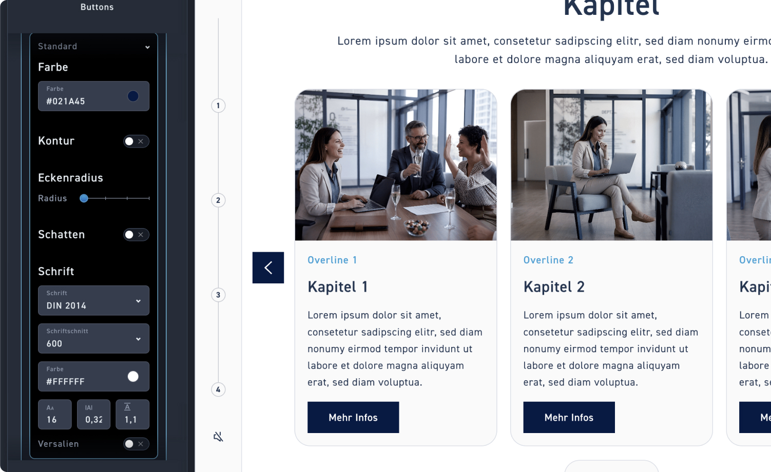
Button color
If you have selected the flat button, adjust the color of the button using the color picker.
Contour
Decide whether your primary button has an outline or not. If it does, reassign it using the color picker and set the outline width.
Corner radius
Choose the corner radius for your primary button. You can set a value from 0 to 3: 0 is completely square and 3 is completely round.
Shadow
Decide whether your primary button has a shadow or not. If it does, assign it again using the color picker and set the size of the shadow.
Writing
Assign a font, a font style, and a color to the button text, and then format it.
Versals
Specify whether the text of your button should be displayed entirely in uppercase.
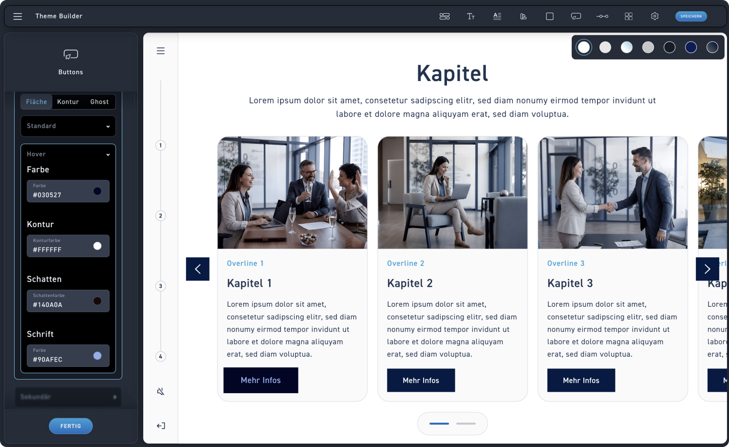
Color
Use the color picker to set the color the button changes to when hovered over.
contour color
If desired, use the color picker to set the color the contour should change to when hovered over.
shadow color
If a drop shadow is desired, set it using the color picker.
shadow color
If a drop shadow is desired, set it using the color picker.
Writing
If necessary, the font color can also change. Set it again or keep the color from the default state.
Check
To see if your settings are correct, hover your mouse over a button at the end or between individual steps, for example like here in the chapter overview element.
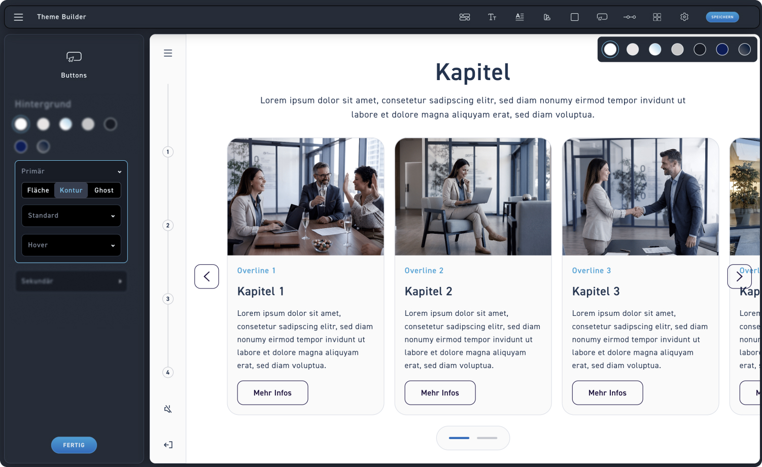
Contour Buttons
The second option for the primary button: The outline button.

Outline color
If you have selected the contour button, adjust the color of the contour using the color picker.
Contour
Decide what kind of border your primary button should have.
Corner radius
Decide what corner radius your primary button should have. You can also set a value from 0 to 3 here: 0 is completely square and 3 is completely round.
Writing
Assign a font, a font style, and a color to the button text, and then format it.
Versals
Decide whether the text on your button should be in all caps.
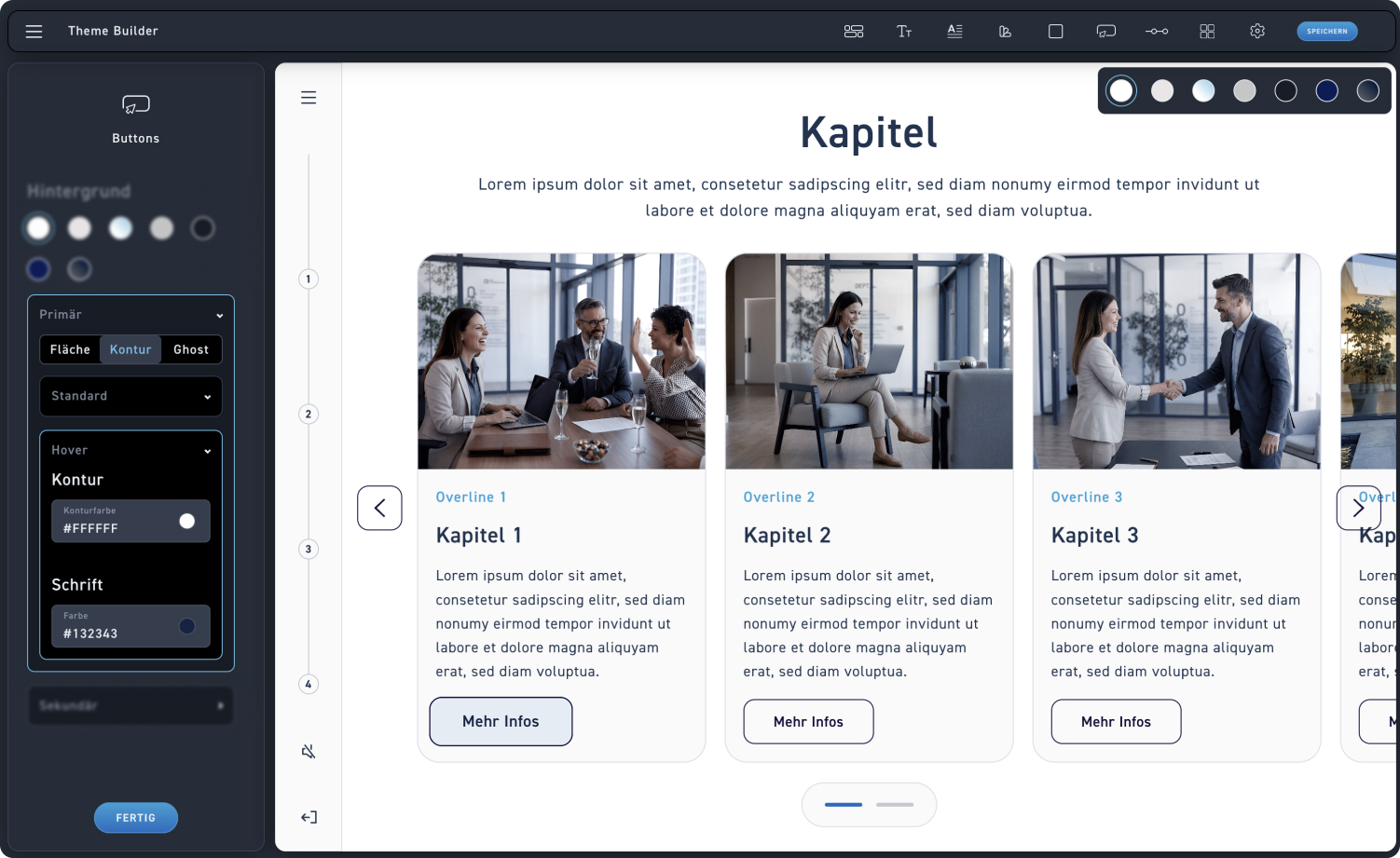
Outline color
Adjust the outline color to be displayed on hover
Writing
Configure how the button text changes on hover
Check
To see if your settings are correct, hover your mouse over a button at the end or between individual steps, for example like here in the chapter overview element.
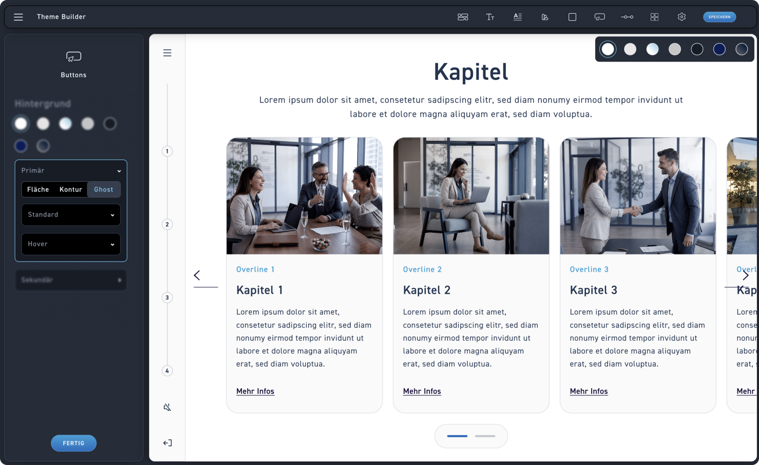
Ghost Buttons
The third option for the primary button: The ghost button.
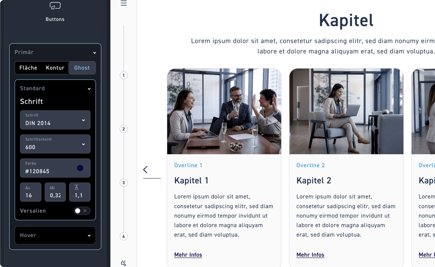
Adjust font
Since the ghost button consists only of text, you can easily adjust the font, font style, and color. You can then format these and, if necessary, enable uppercase letters.
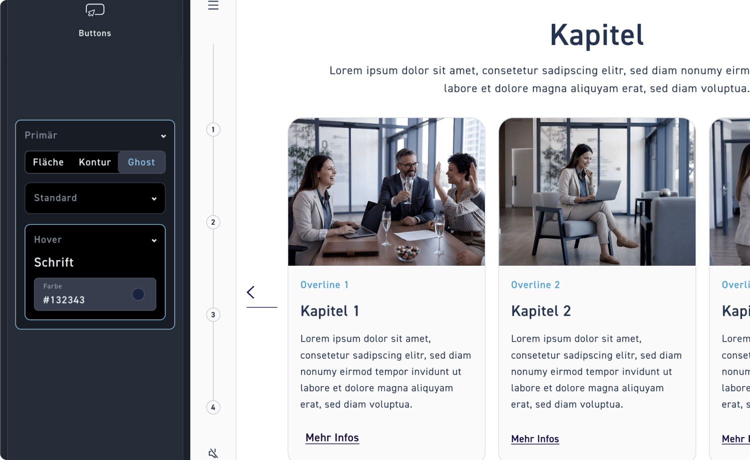
Font color
Set how the font changes on hover
Check
To see if your settings are correct, hover your mouse over a button at the end or between individual steps, for example like here in the chapter overview element.
Font color
Set how the font changes on hover