Accordion
Application #
The accordion element is perfect for presenting content in a space-saving and clear manner. Learners can expand and collapse individual sections as needed, making long content more structured and easier to digest.
Video tutorial #
Learn in the following video tutorial how to create the element
Step 1 – Add Accordion #
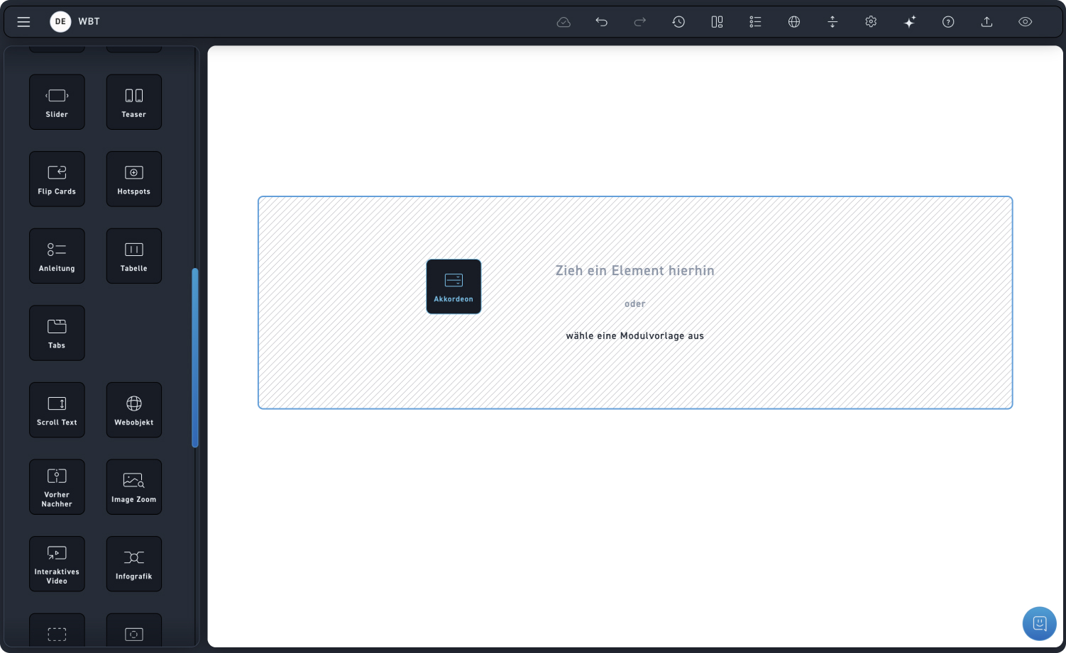
Drag the accordion element into a module.
Step 2 – Layout Settings #
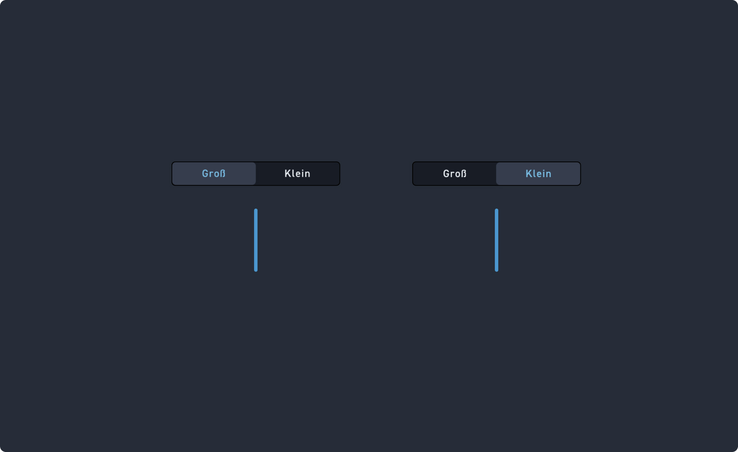
Check out the hotspots to see what customization options you have for the accordion element.
1
Large
If you choose the large view of the accordion, each accordion tab is displayed wide.
2
Small
If you choose the compact accordion view, each accordion tab will be displayed narrower.
Manage accordions #
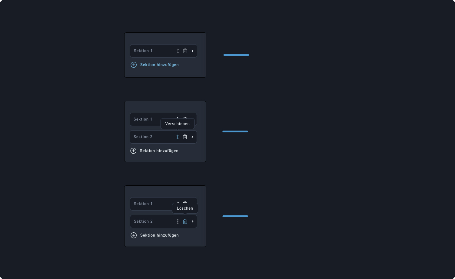
Check out the hotspots to see what management options you have for the accordion element.
1
Add section
Click Add Section to insert another section into the accordion.
2
Section layout
Swap the order of the sections by clicking and dragging the move icon.
3
Delete sections
Delete sections by clicking the trash can icon.
Step 3 – Edit content #
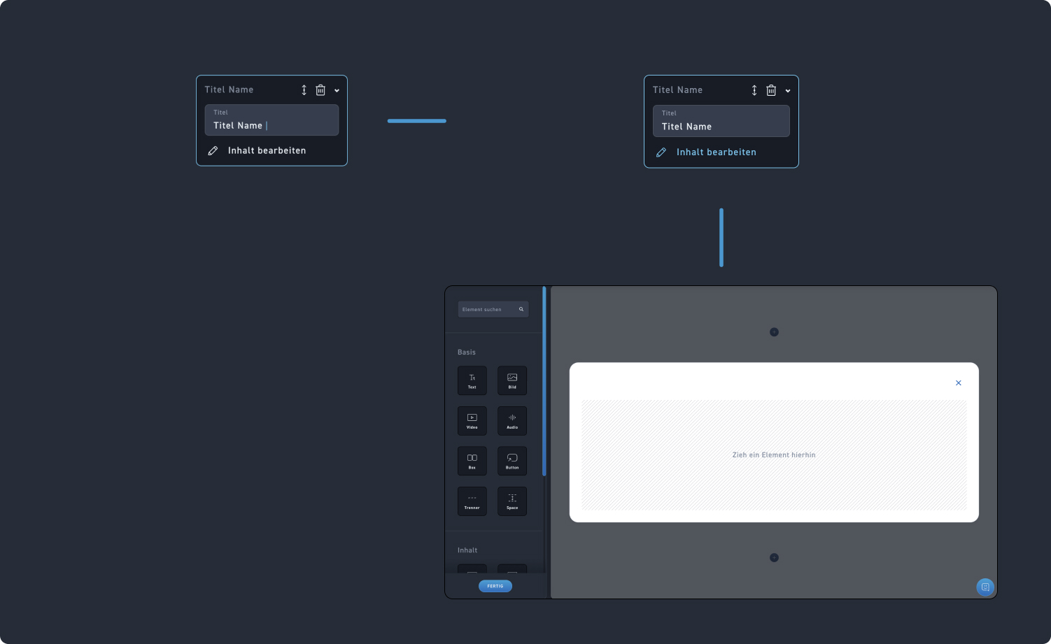
Check the hotspots to see how to populate the accordion element with content.
1
Section Title
Add a title to the section. You can type this directly into the accordion element itself or into the edit box.
2
Edit content
Click on Edit Content or directly on the edit icon within the element when you expand the accordion, and edit the tab as an overlay.