Style

Application #

The Style section defines the visual foundation of your application. With the global settings for corner radii and shadows, you ensure a harmonious overall look. The best part: all components—from the large screen to the small button—adapt automatically. This keeps your design completely consistent and professional without any manual effort.

Step-by-step guide #

Look at the hotspots and learn how to adjust the style.

1
Define the corner radius
Use the slider to determine how much the corners of boxes, buttons, and containers are rounded. You can see your change immediately in the live preview—from completely sharp-edged to softly rounded.
2
Drop shadow
Adjust the depth and intensity of the shadow. This gives your elements more visual depth.


Look at how the corner radius changes #

It is applied directly to elements such as the text area of the big slider, tables, tabs, sliders, teasers, and flip cards.

Value 0 #

Value 1 #

Value 2 #

Value 3 #

Slide Indicator #

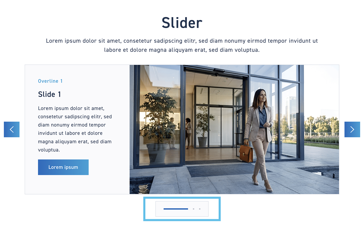
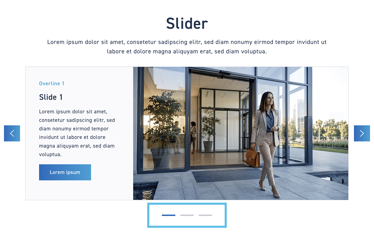
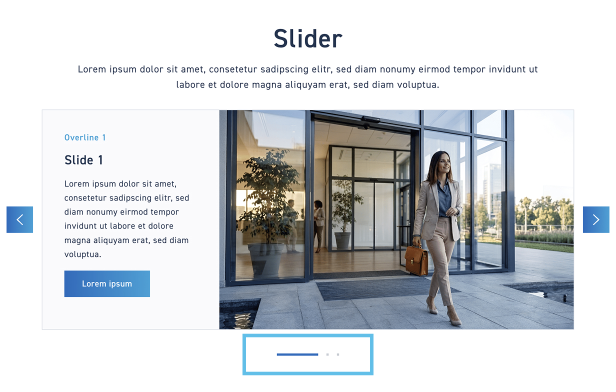
The slide indicator can be displayed as a solid area or transparent. Then, decide whether the individual slides should be indicated by lines or dots.

1
Slide Indicator
Determine the style of the slide indicator
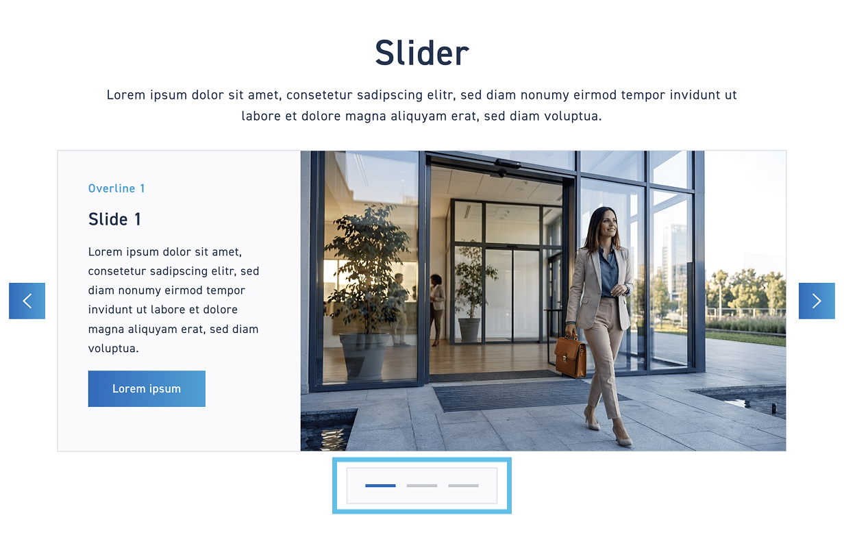
Areal indicator with lines #

Area indicator with dots #

Transparent indicator with lines #

Transparent indicator with dots #