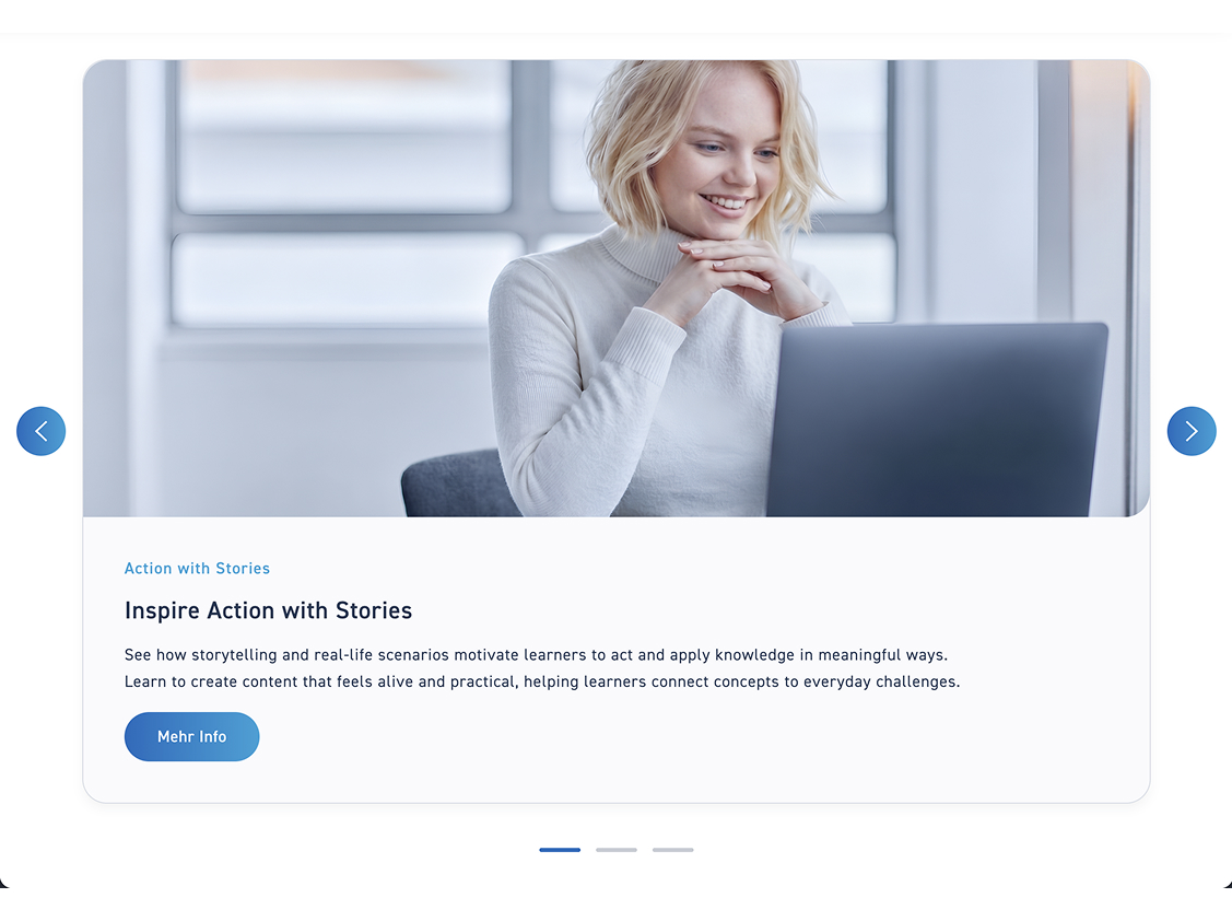
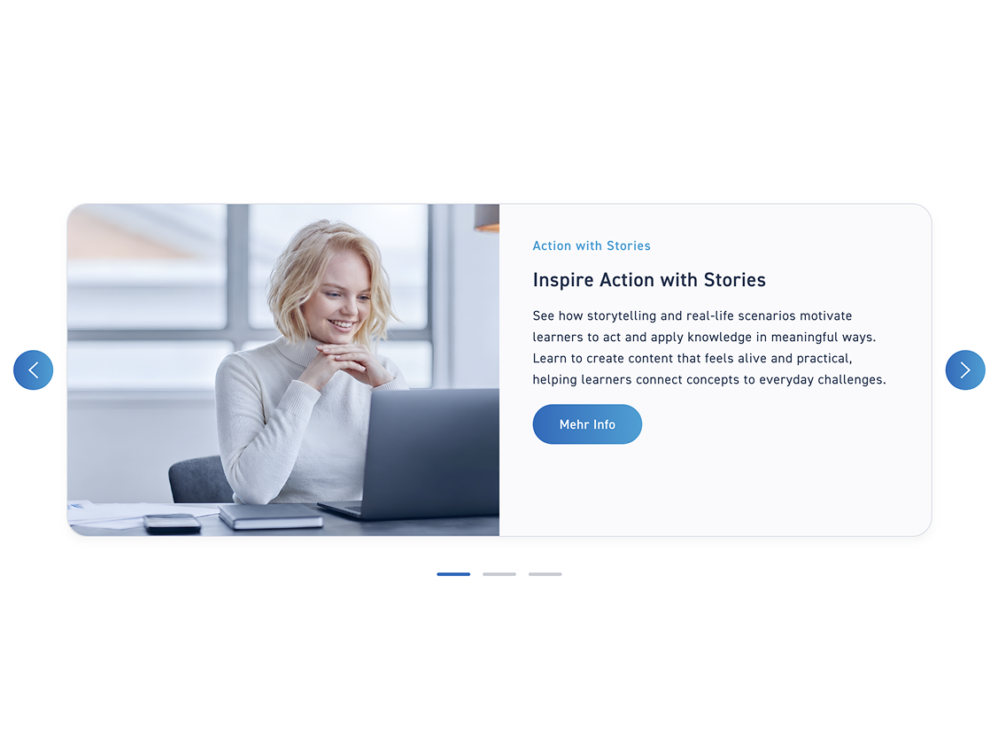
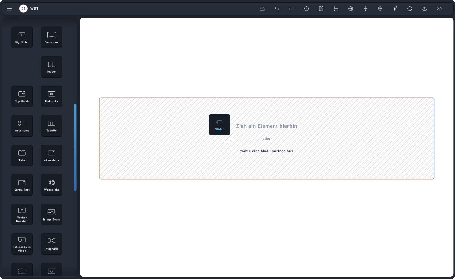
Slider
Style
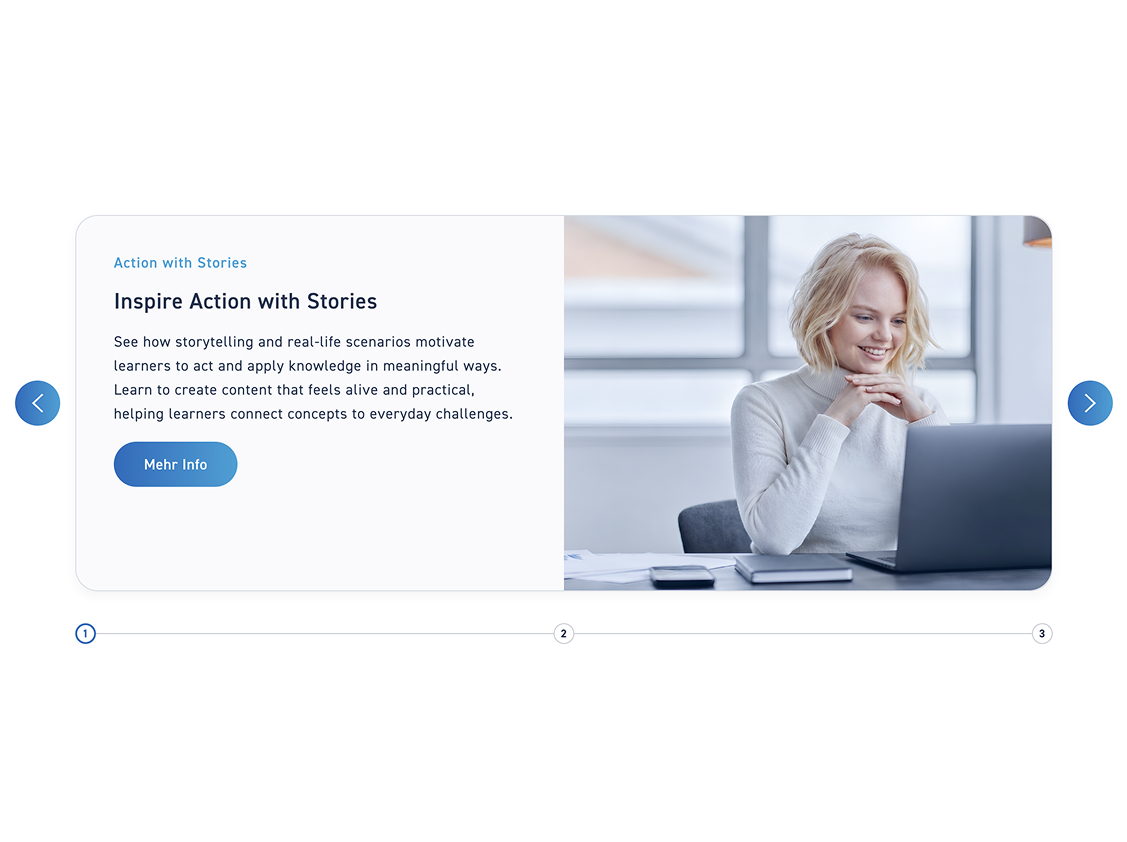
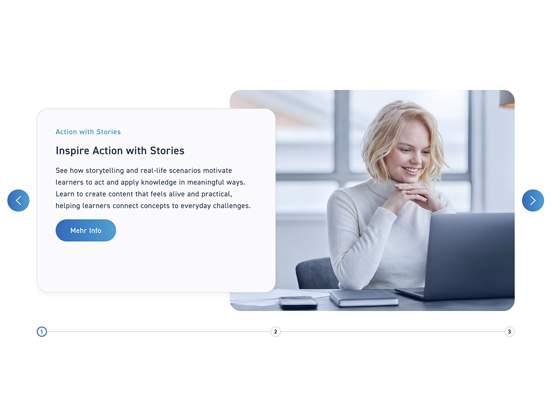
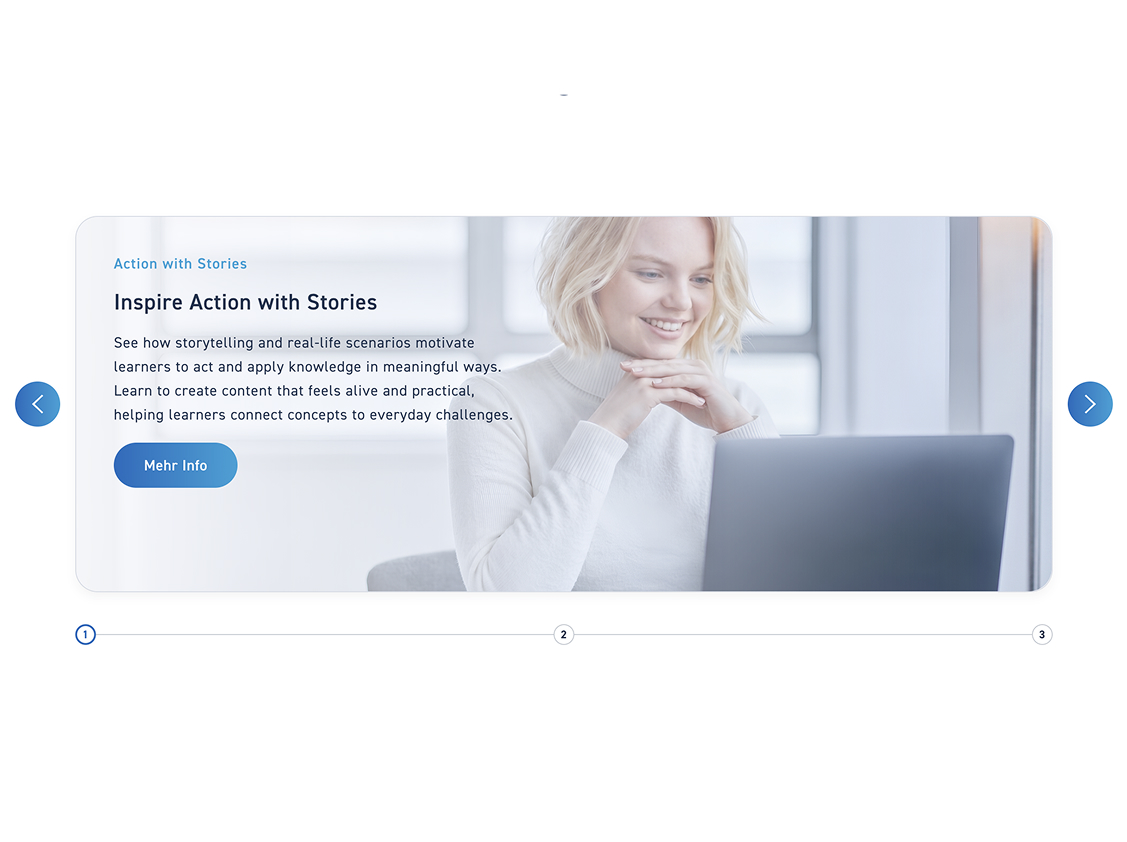
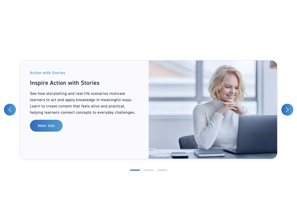
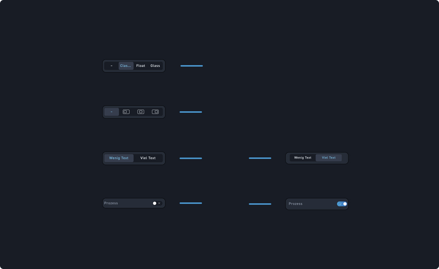
Decide whether your slider has a Classic, Float, or Glass style.
Alignment
Decide whether your slider should be aligned to the left, center, or right.
Text
Select whether your slider has little or a lot of text. This influences whether your image is displayed larger or smaller.
process
Turn on the toggle if you want your slider to become a process slider with the steps displayed at the bottom.
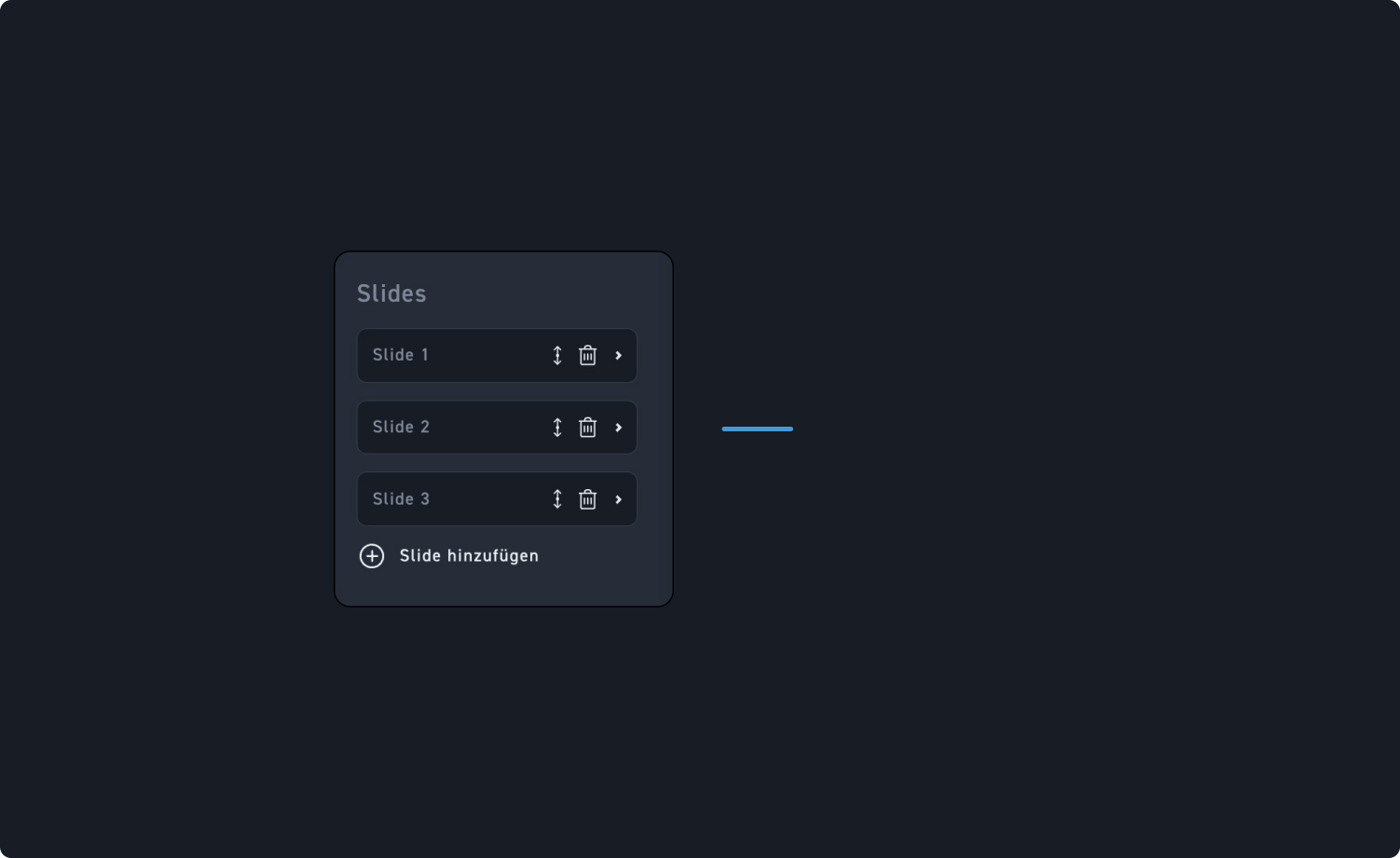
Slides
Click on a slide to edit its content, adjust the order of the slides, or delete slides using the trash can icon. You can create additional slides at any time by clicking „Add slide“ below the last slide.
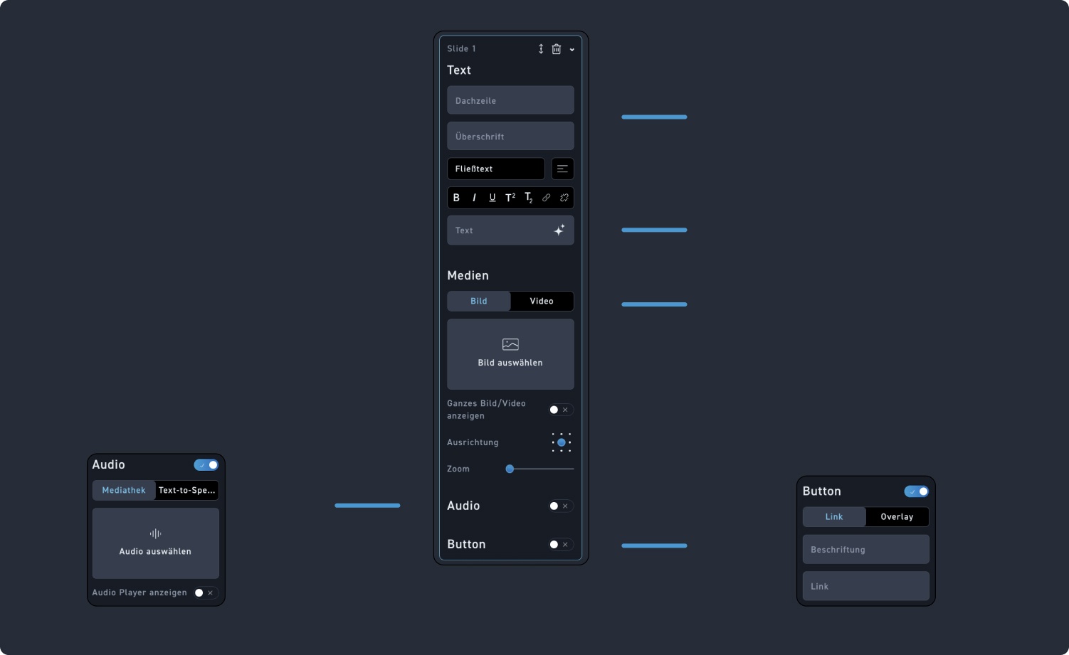
Text
Add a kicker or a heading to your slide. Both are optional.
running text
Add running text to your slide. You can add it either directly in the element or—as shown here—in the edit box. Afterward, you can format the text using the rich text editor.
Media
Determine whether the slide should be displayed with an image or a video, and then select the appropriate media from the media library.
Audio
Turn on the toggle if your slide has an additional audio track. When you turn it on, just like with the audio element, you have the option to use an audio track from the media library or the text-to-speech function.
Button
Turn on the toggle if your slide should get a button. You can add a label and a link to the button or edit it as an overlay.